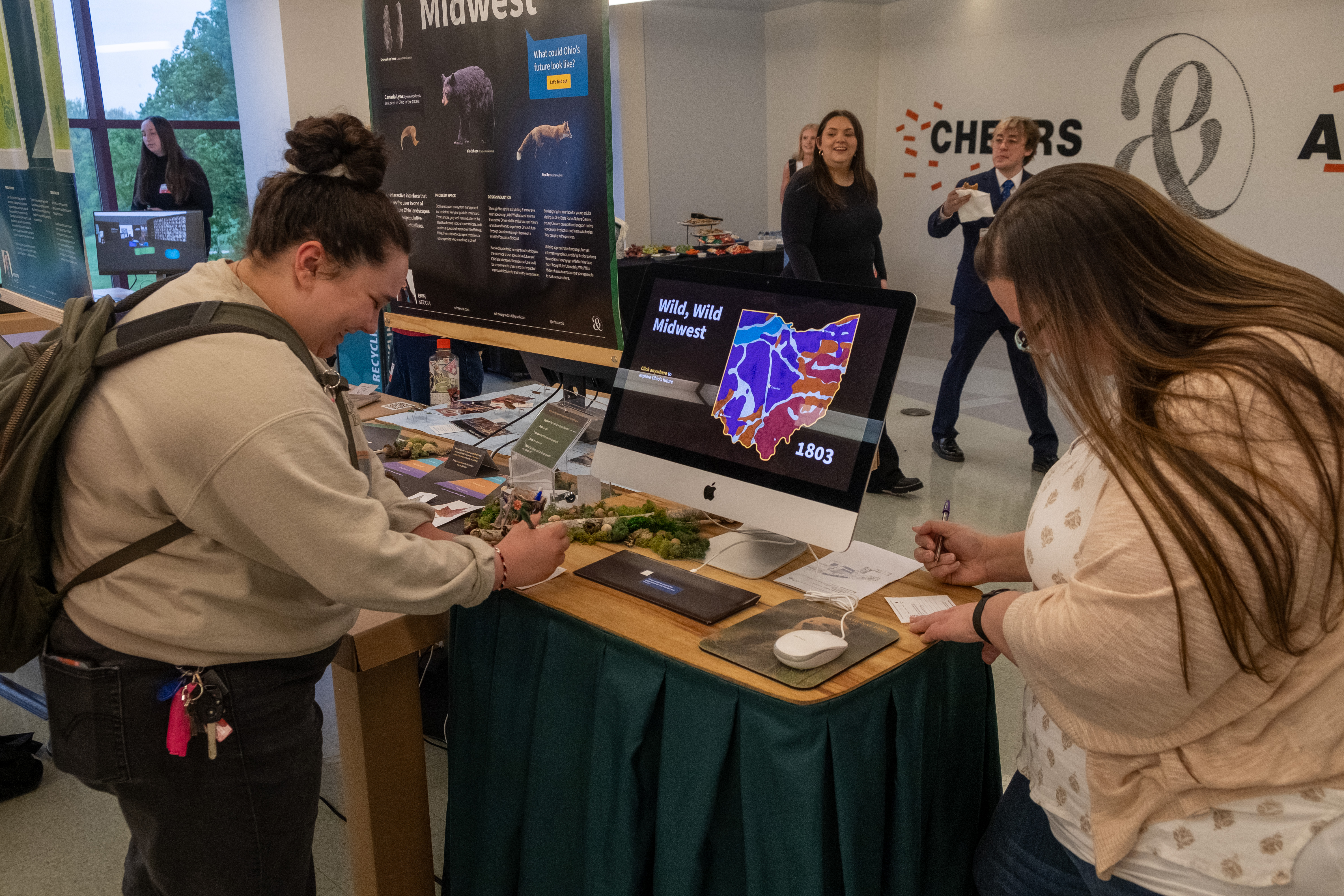
Wild, Wild Midwest
An interactive interface that centers the user in one of three future Ohio landscapes based upon speculative biodiversity fluctuations.
Check it out on Behance!
Goals
This project began as an experiential graphic design project but quickly transformed into a UX/UI project to better suit the audience and project goals.
My ultimate goal was to teach Ohioans about their native species in a fun, informative, and intriguing way.
My ultimate goal was to teach Ohioans about their native species in a fun, informative, and intriguing way.

Methodology
Utilizing strategic foresight methodologies, I was able to research and synthesize information to make informed speculations about what Ohio’s future could look like.
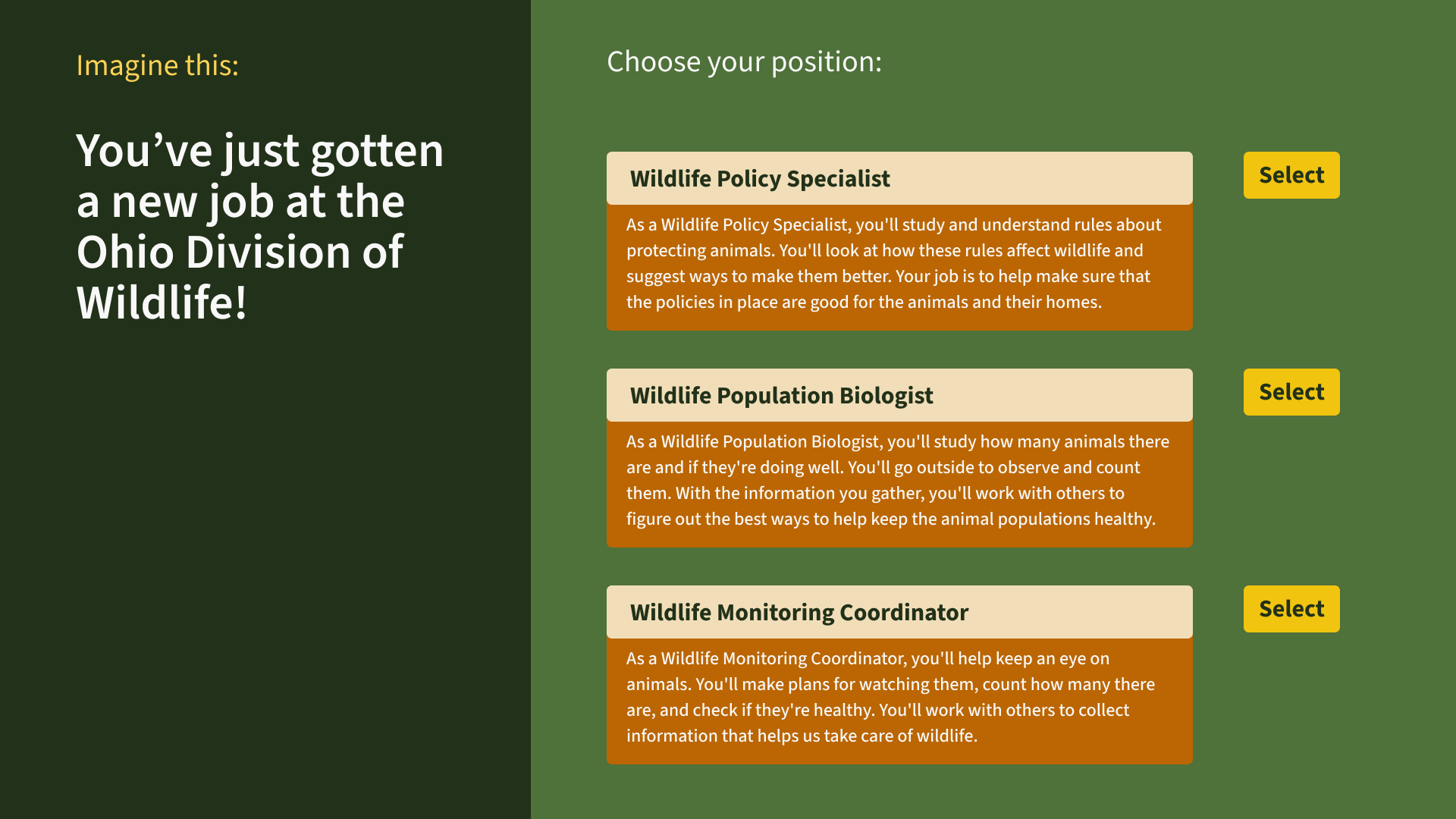
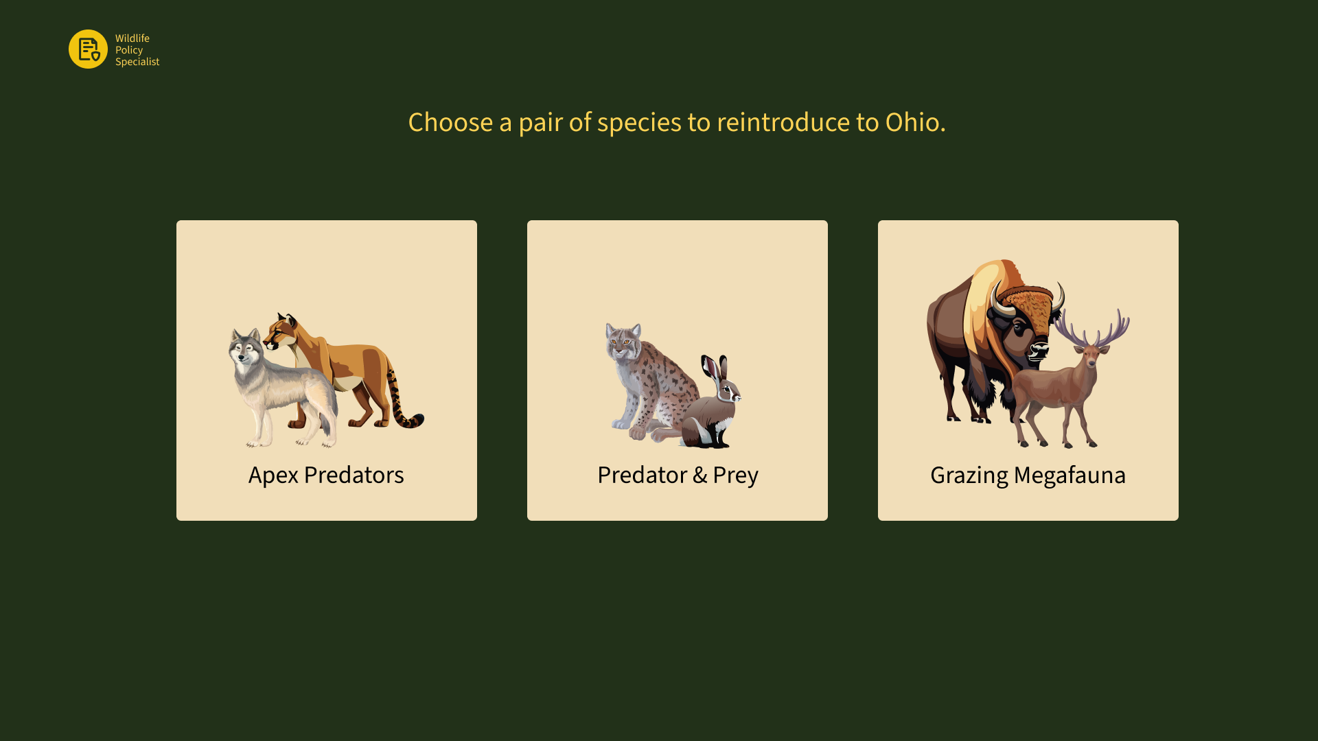
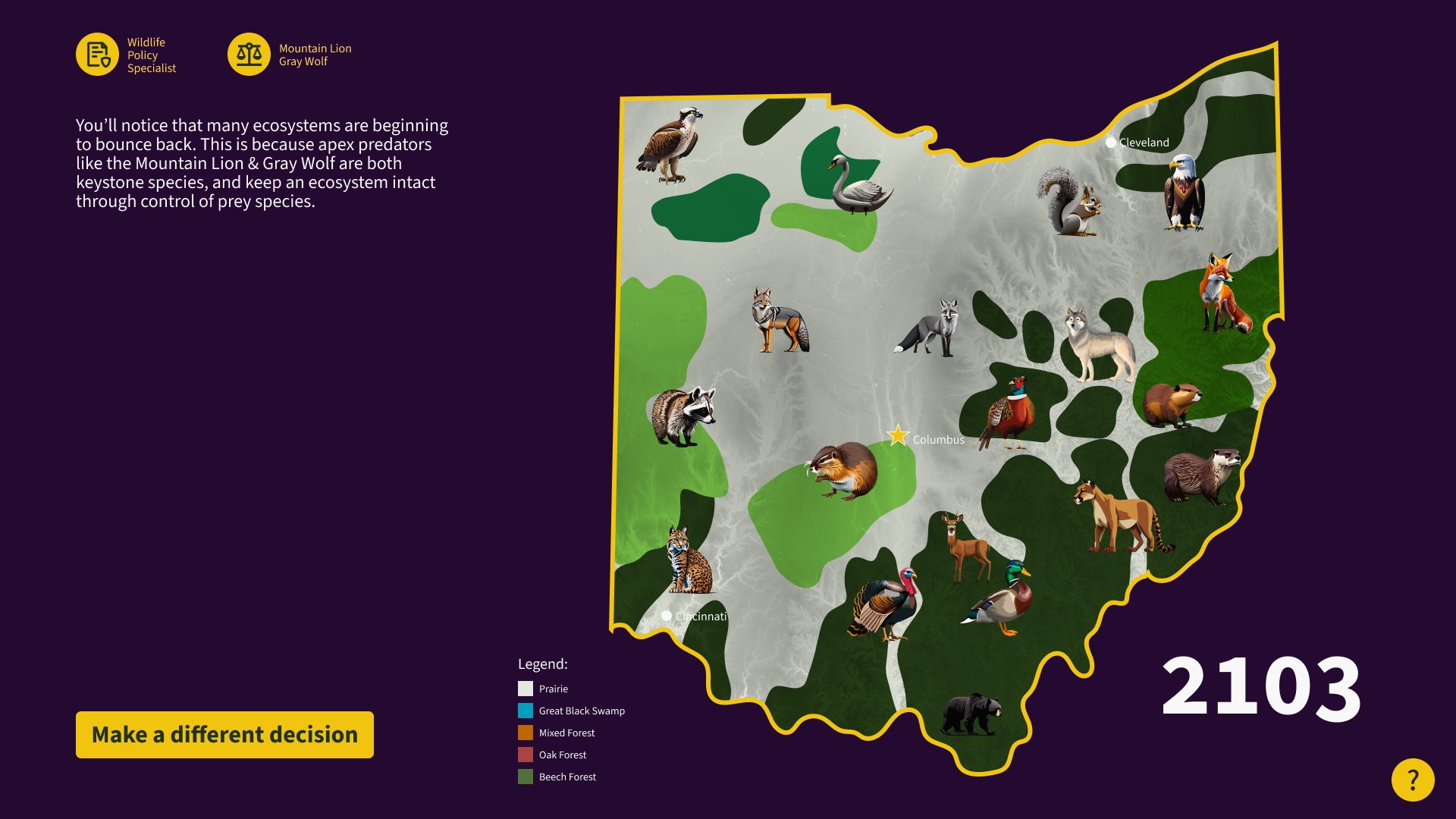
The interface speculates about Ohio’s future given 3 different groupings of species reintroduction. By using extirpated species as a means of communicating environmental impact, the experience is thought-provoking and visually intriguing.
The interface speculates about Ohio’s future given 3 different groupings of species reintroduction. By using extirpated species as a means of communicating environmental impact, the experience is thought-provoking and visually intriguing.

Ideation
This project changed a lot from its initial conception of an EGD project. I went through a lot of iterations - I knew what I wanted to display on the page, I just had to figure out how to best display it. Pacing, timing, and hiding information at certain points was key to a successful experience.


Installation
This project was created for my senior capstone project for the completion of my Bachelor of Science in Design from the University of Cincinnati.
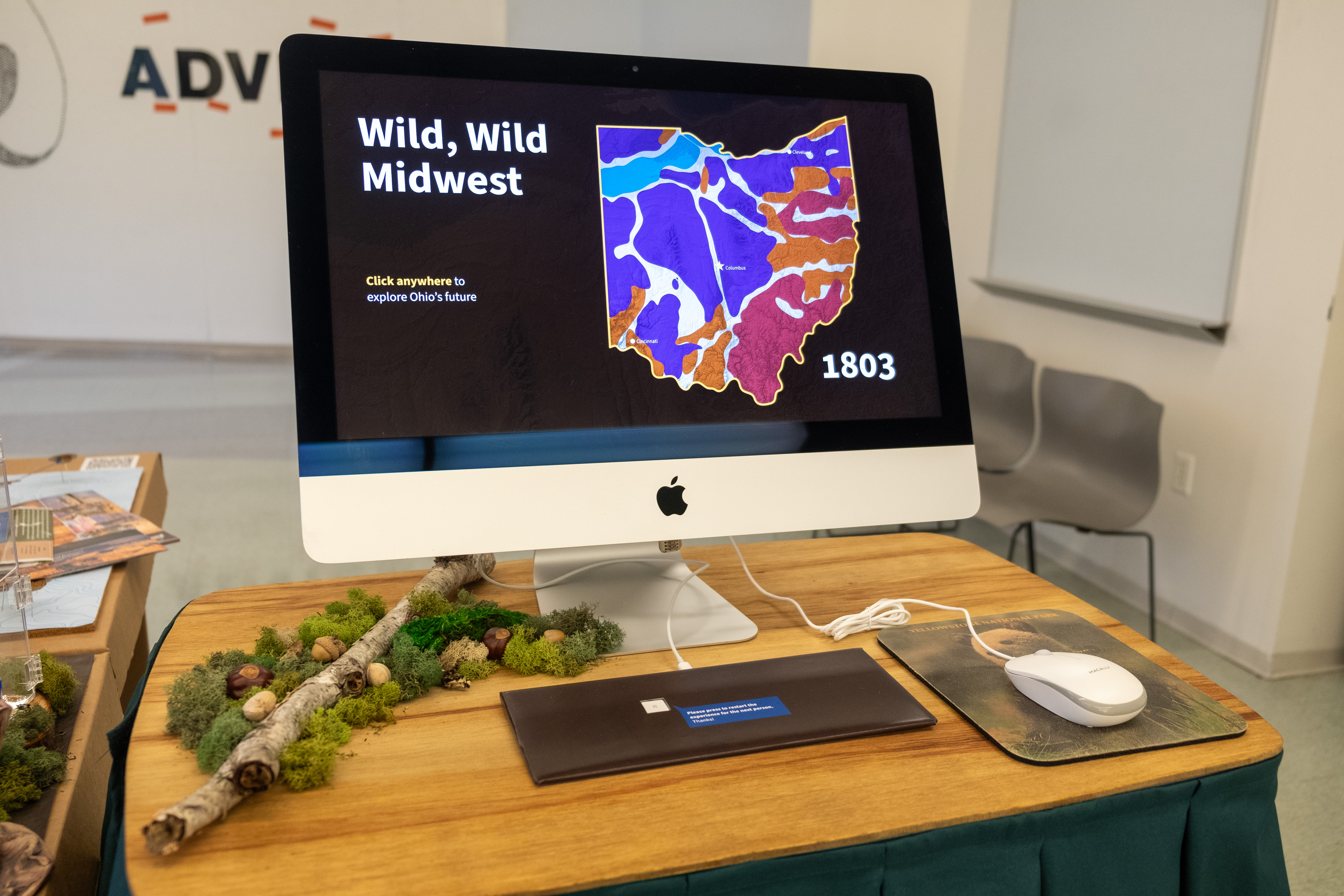
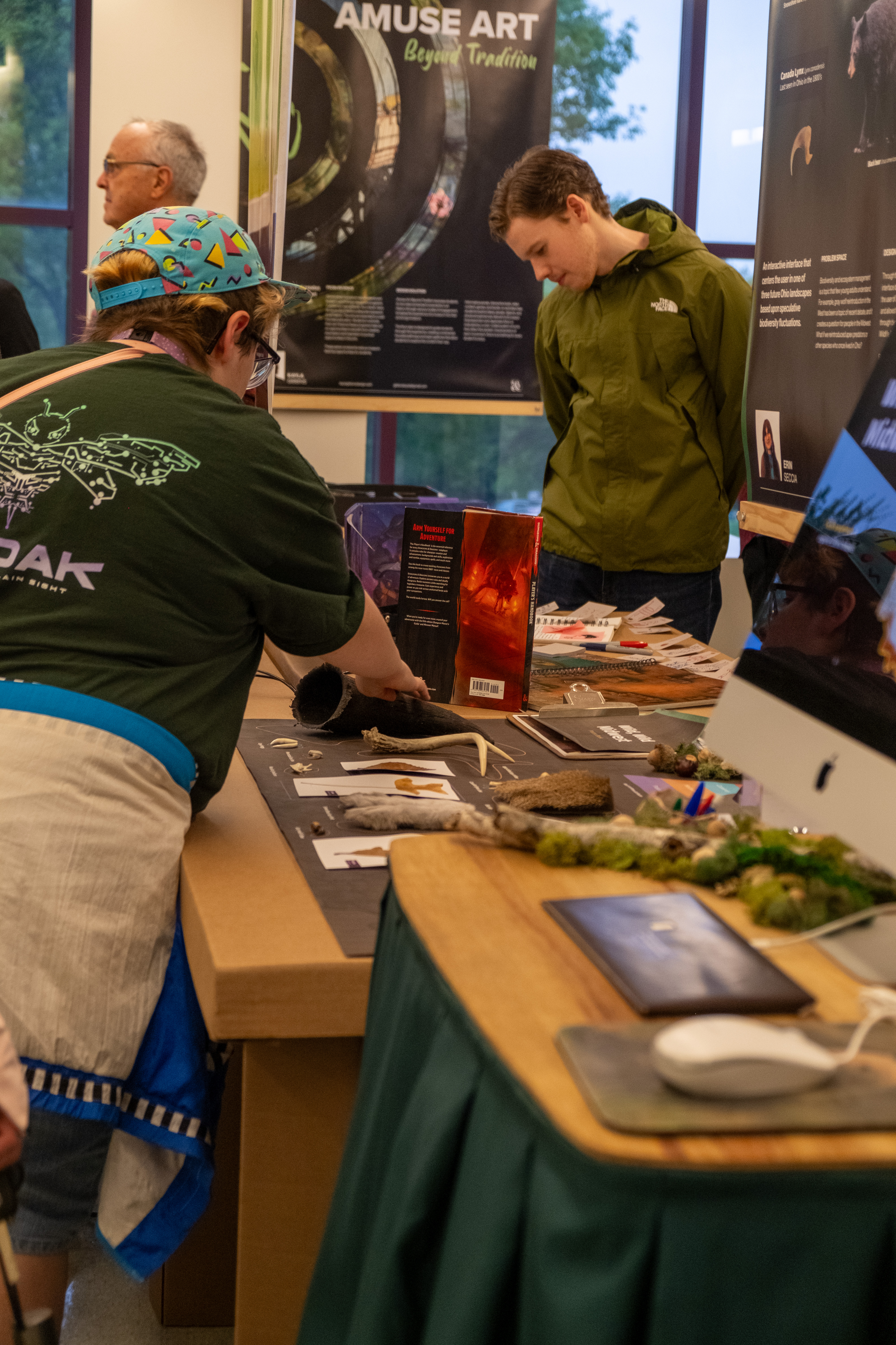
The final installation ran for 5 days as part of the 2024 DAAPWorks showcase.
Installation was much more than just the interface - it was also the way it was displayed to create a further immersive experience.
I chose to include artifacts from species discussed in the interface in order to make the experience feel more like that of visiting an Ohio State Park’s visitor center - the intended context of Wild, Wild Midwest.

Final Prototype Walkthrough
Final Project Display


Explore my prototype here!
Thanks for taking time to check out this project. It’s been the culmination of a full year of schoolwork, and was truly so exciting to work on.
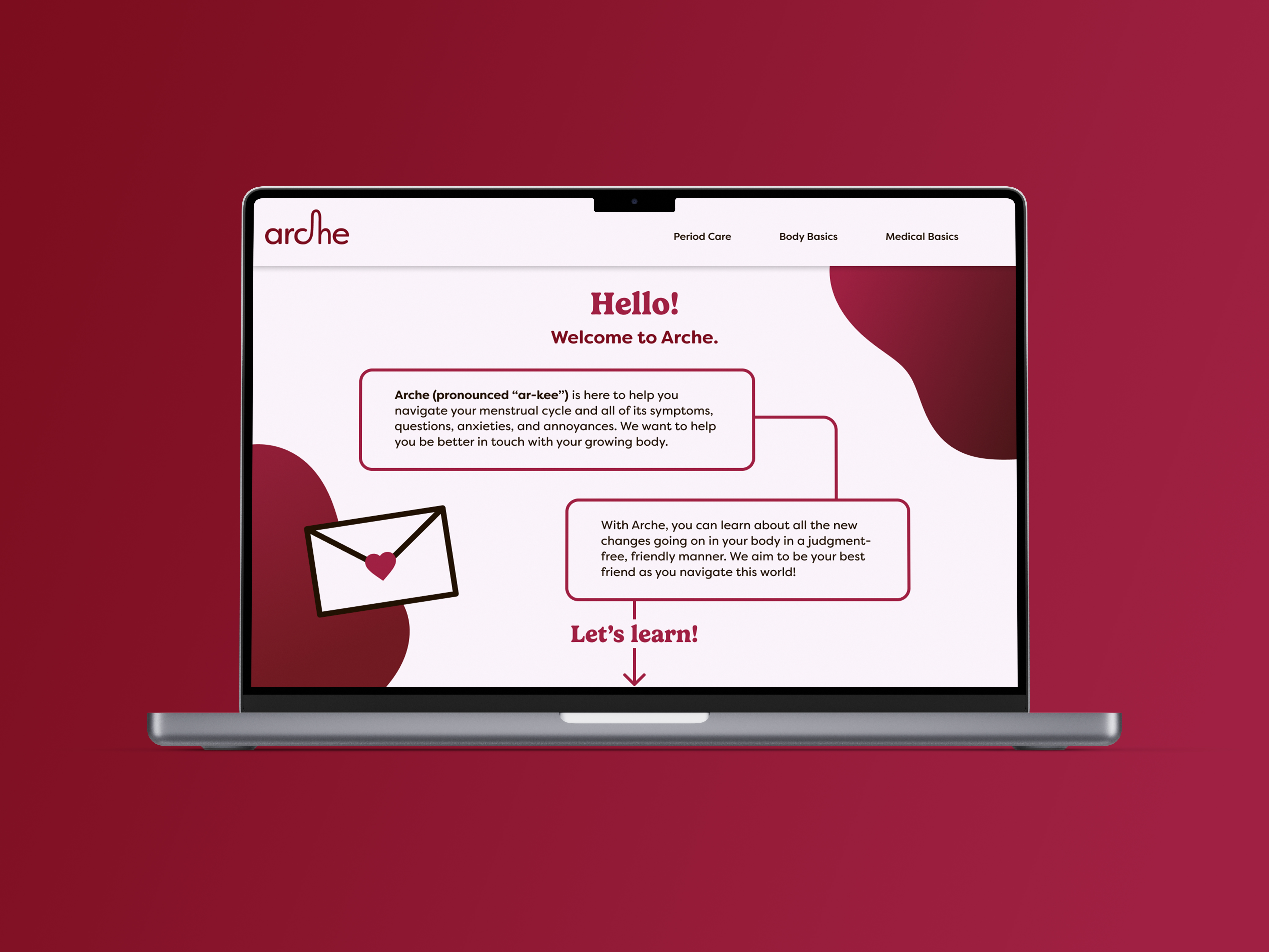
Arche
A web resource for menstruating adolescents.
Research
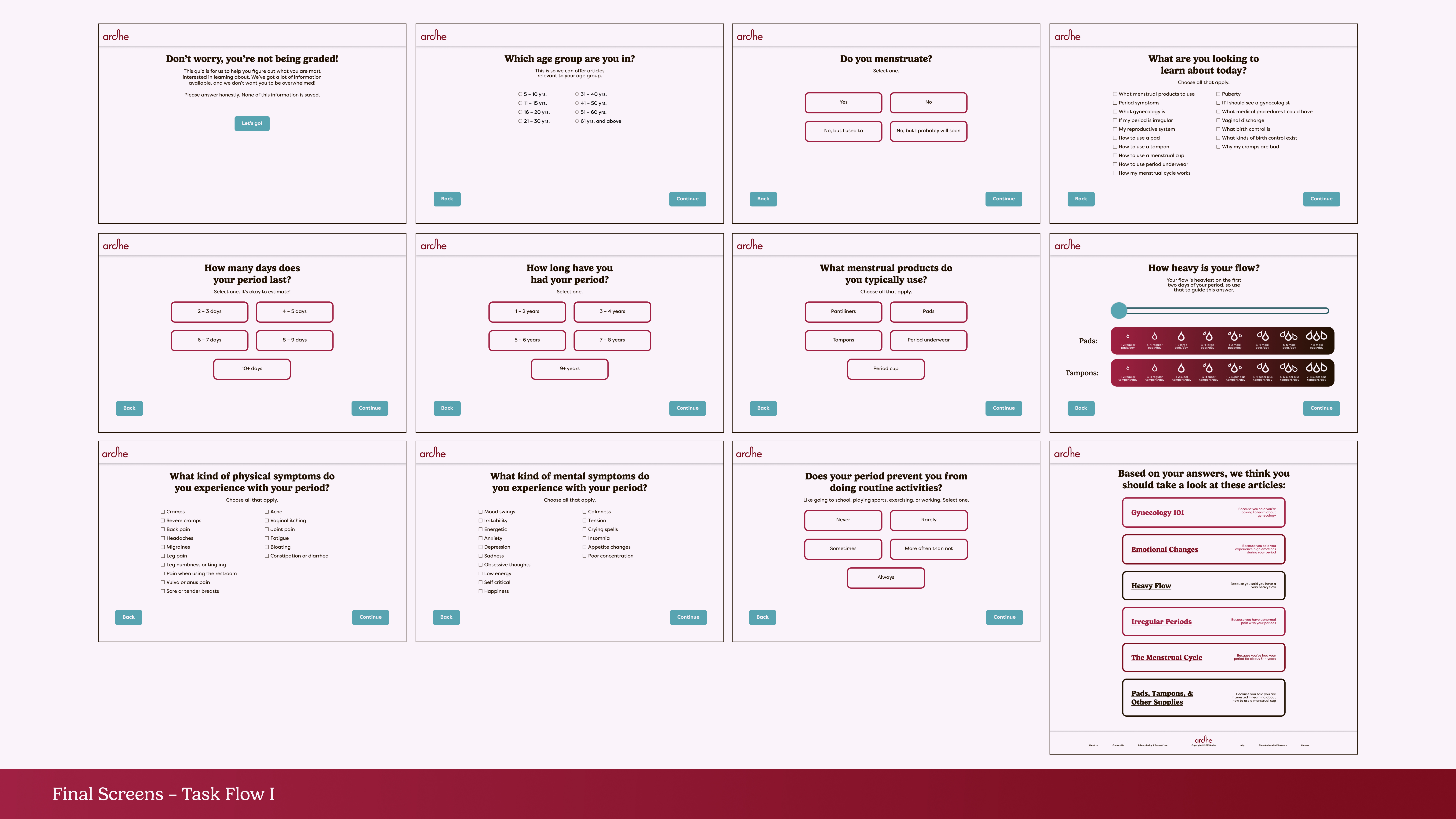
The research phase of this project included benchmarking similar sites, card sorting exercises, and user prototype testing.
Creating these tests surrounding Robin’s user journey allowed me to further immerse my audience in the experience and provide relevant feedback.
Creating these tests surrounding Robin’s user journey allowed me to further immerse my audience in the experience and provide relevant feedback.

Wireframes
Upon conclusion of research, I began to wireframe in order to test my prototypes and gather feedback.


Design System
Ideation upon various design systems led me to create a moody yet approachable color palette and typographic selection.
This resource is meant for all adolescents who menstruate - meaning the color palette had to remain friendly and inviting, not girly or childish. It’s important to meet young people where they are and understand their needs.
This resource is meant for all adolescents who menstruate - meaning the color palette had to remain friendly and inviting, not girly or childish. It’s important to meet young people where they are and understand their needs.


Final Design System
By design, Arche is strictly a website. This is because the topic of menstruation may still be seen as “taboo” for adolescents, especially those who don’t conform to typical gender norms. It’s important that each adolescent be able to access this webpage and close it quickly if necessary.
Ideally, this website would expand to include more information about the reproductive systems and be a one-stop-shop for school nurses to point their students to. By partnering with schools, Arche can reduce stigma surrounding menstruation and dispel information to those in need.
Ideally, this website would expand to include more information about the reproductive systems and be a one-stop-shop for school nurses to point their students to. By partnering with schools, Arche can reduce stigma surrounding menstruation and dispel information to those in need.


Prototype Walkthrough
Cincinnati Zoo Habitat Signage
A partner project created for my Design Systems II class exploring experiential graphic design.
Client
Our chosen client, the Cincinnati Zoo & Botanical Garden, is known as the Greenest Zoo in America for its commitment to sustainable practices and contribution to conservation.
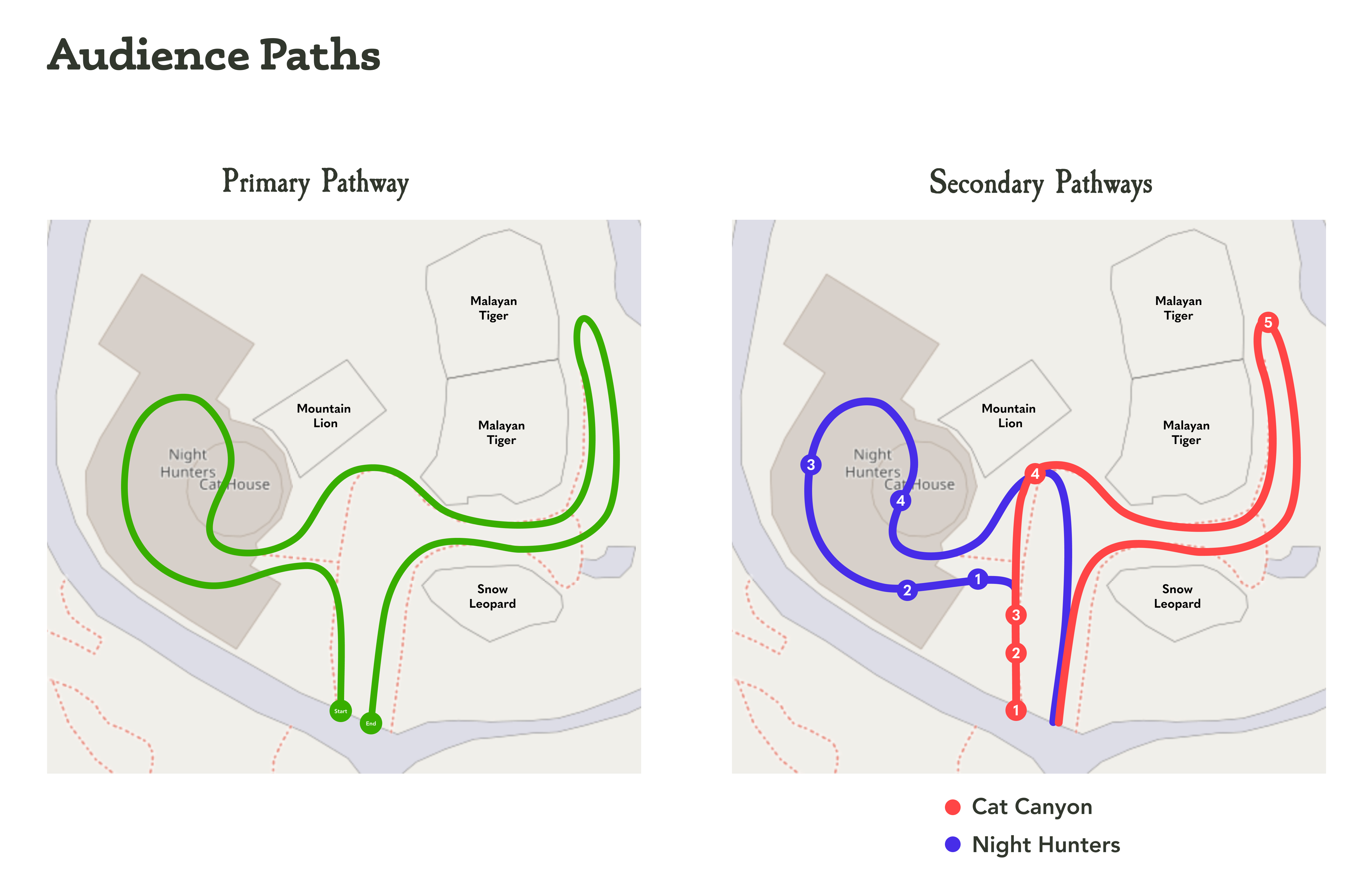
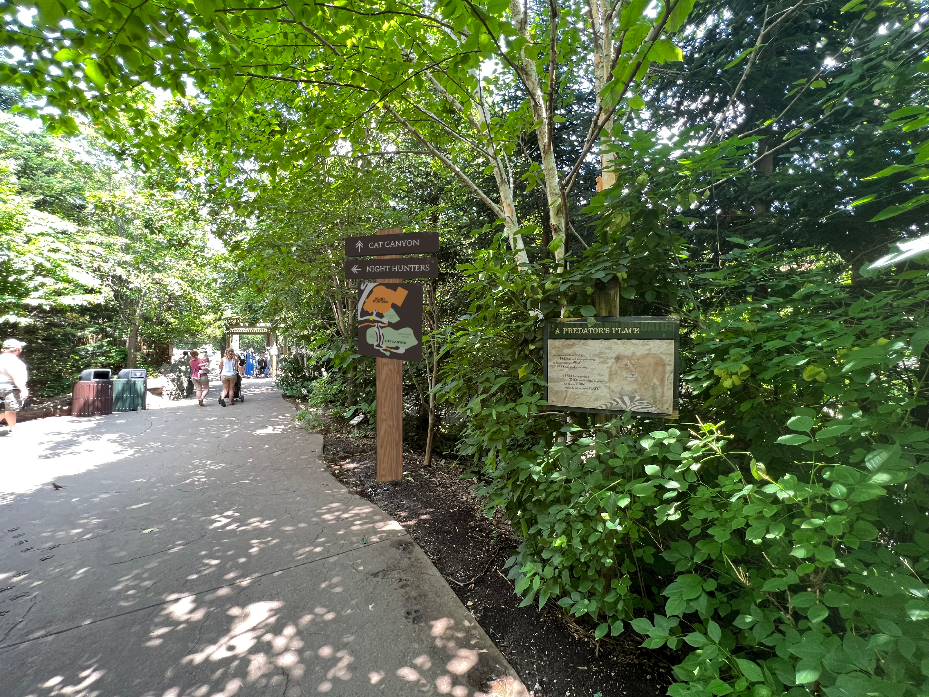
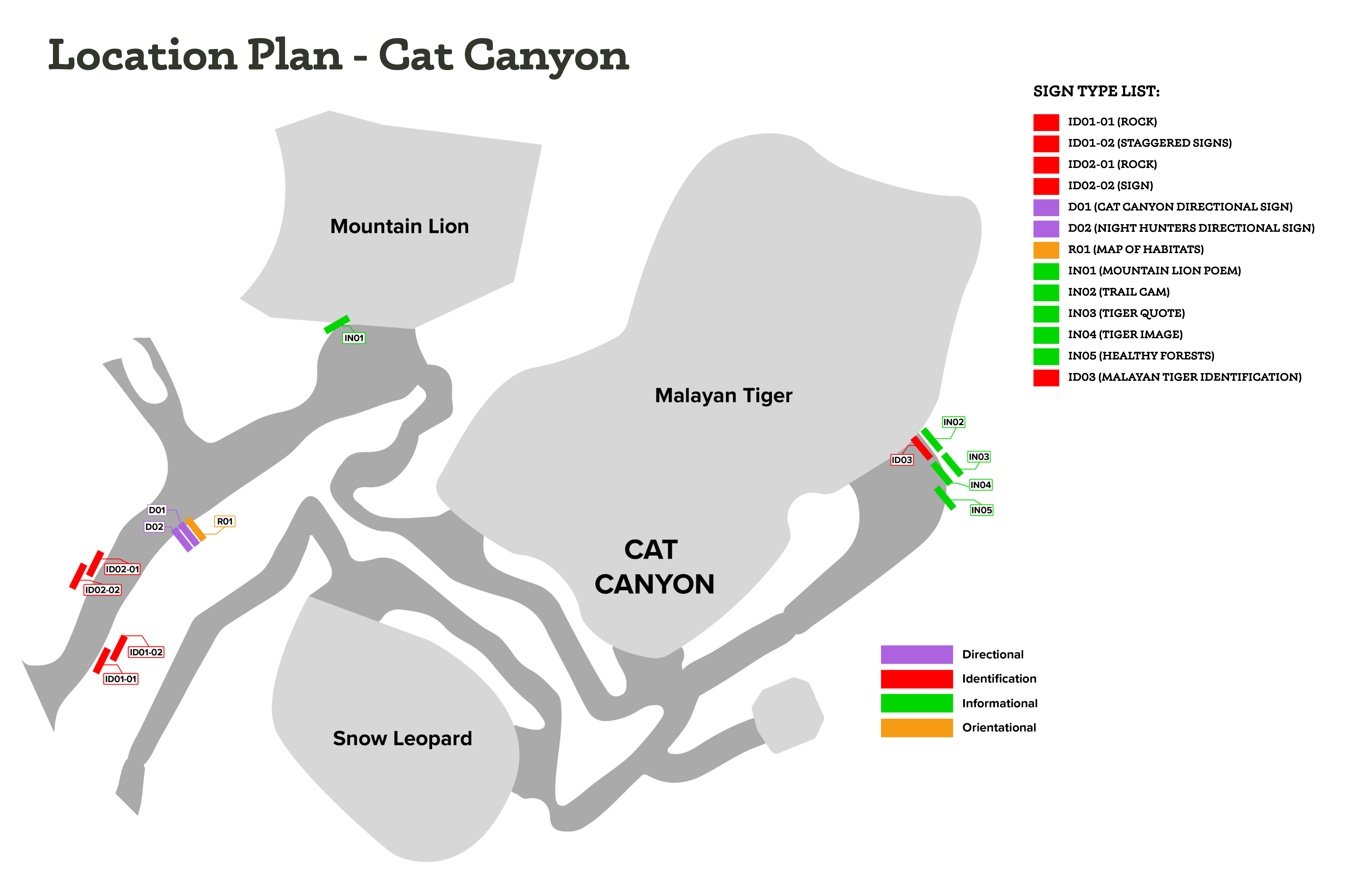
We identified two key locations for signage improvement within the Cincinnati Zoo: the habitat areas for Cat Canyon and Night Hunters. These habitat areas are located right next to each other at the Zoo, and visitors often visit both habitat areas, rather than just one or the other.
We identified two key locations for signage improvement within the Cincinnati Zoo: the habitat areas for Cat Canyon and Night Hunters. These habitat areas are located right next to each other at the Zoo, and visitors often visit both habitat areas, rather than just one or the other.

Phase I - Gather Insights
We were tasked with creating a wayfinding system - but due to the unique nature of our client, our signage system began to evolve into an educational & wayfinding signage project.
After determining the habitat areas we wished to improve, we crafted a survey to gather guest feedback on current signage and met with the Design Director at the Zoo to implement it.
We identified nine signs - five across Cat Canyon and four across Night Hunters - that we could work to improve throughout the semester.

Phase II - Ideate & Improve
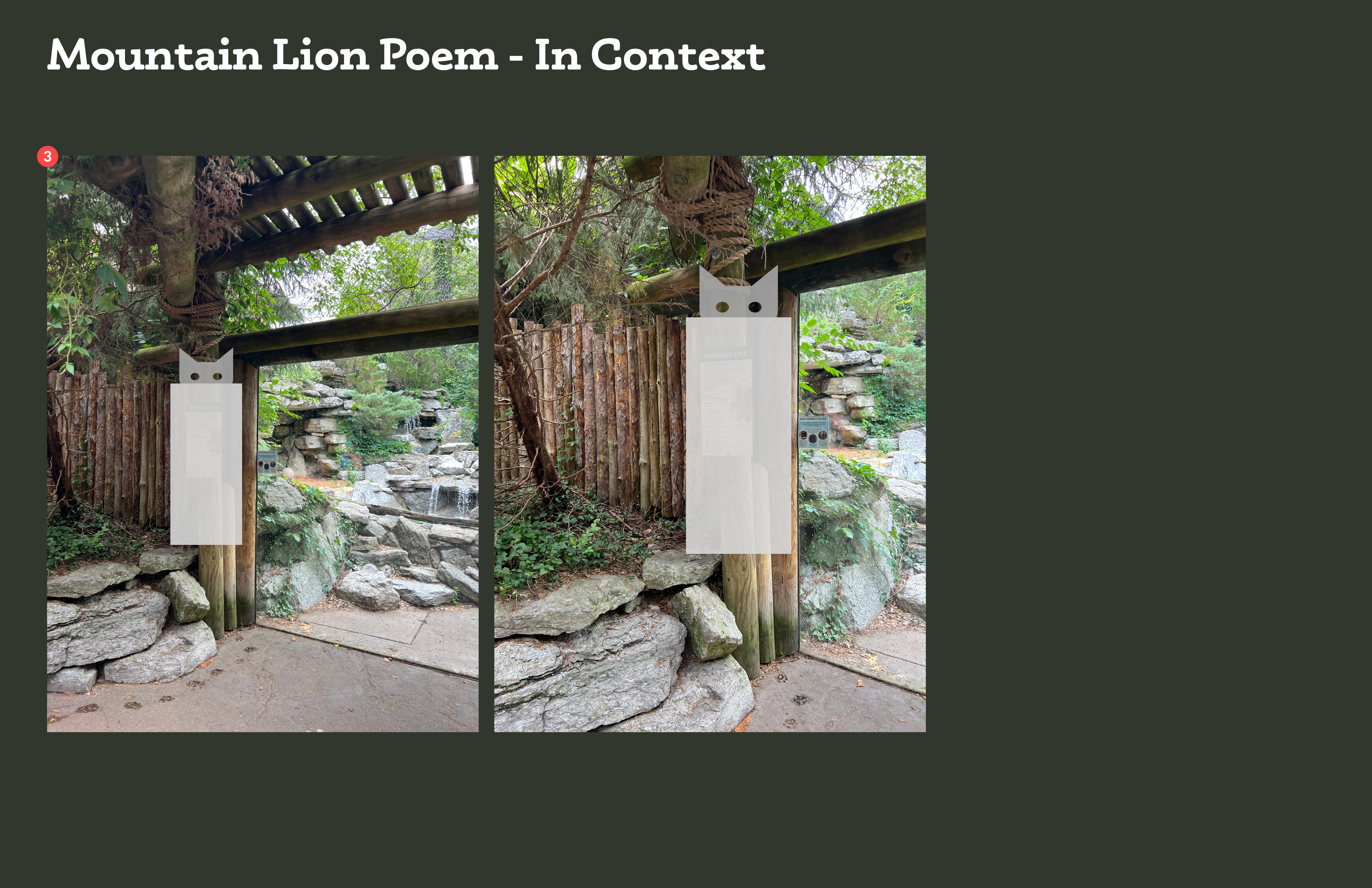
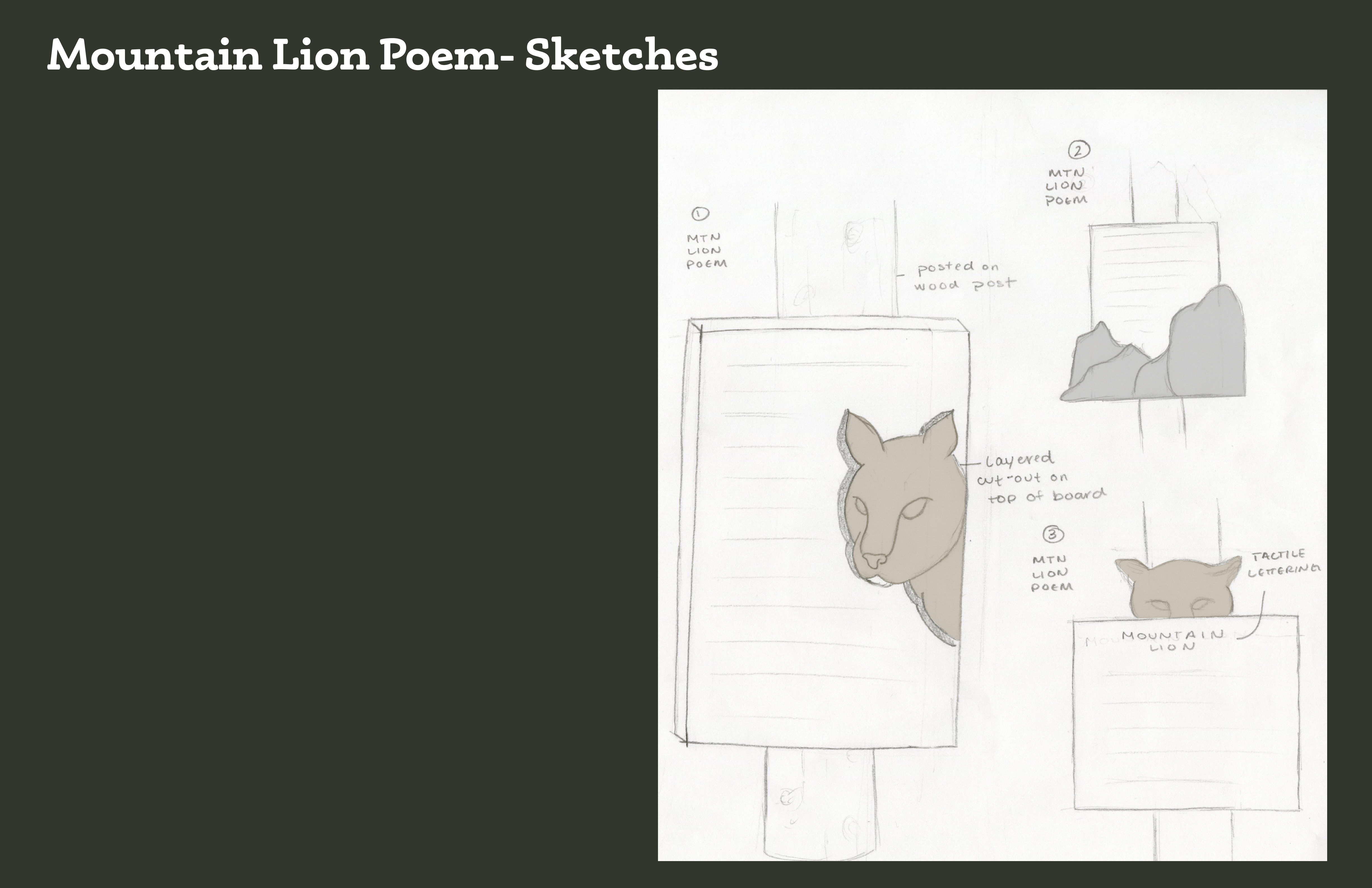
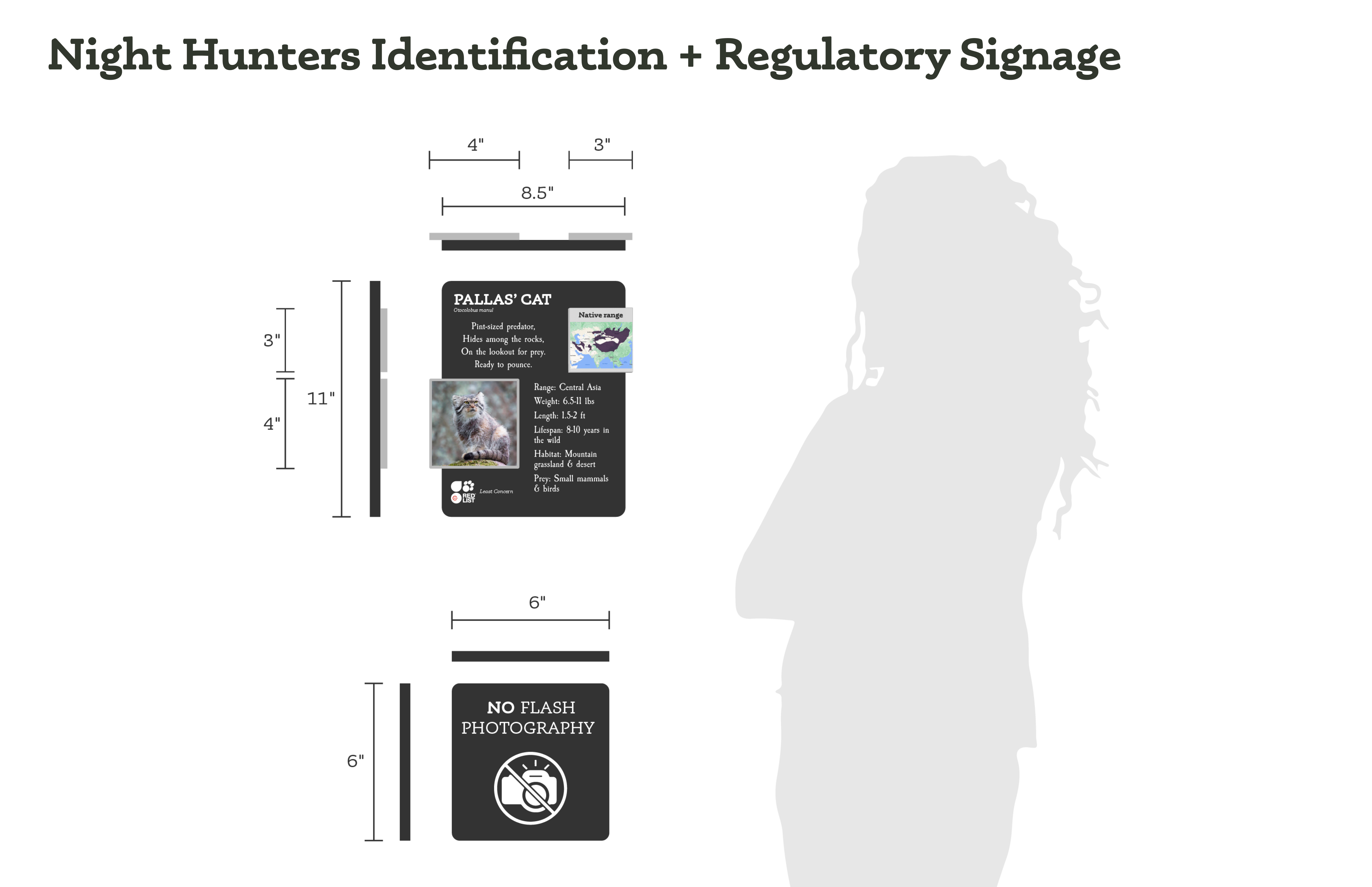
From guest feedback, we determined that there was a need and desire for more tactile signage as well as more educational information.
We began ideating upon improvements for each of our nine selected signs.
We began ideating upon improvements for each of our nine selected signs.


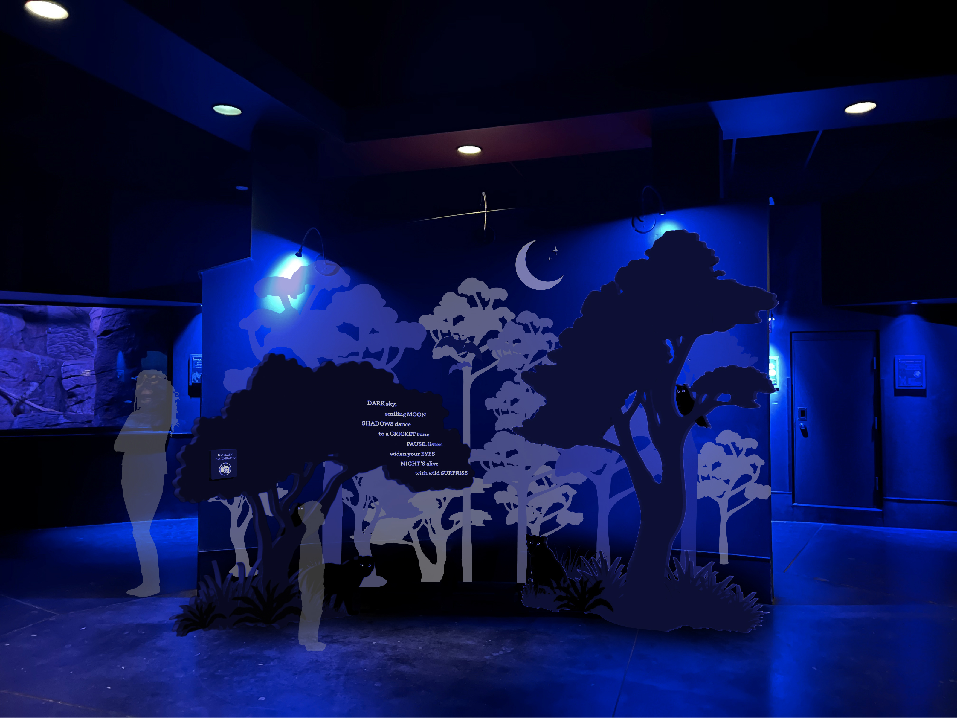
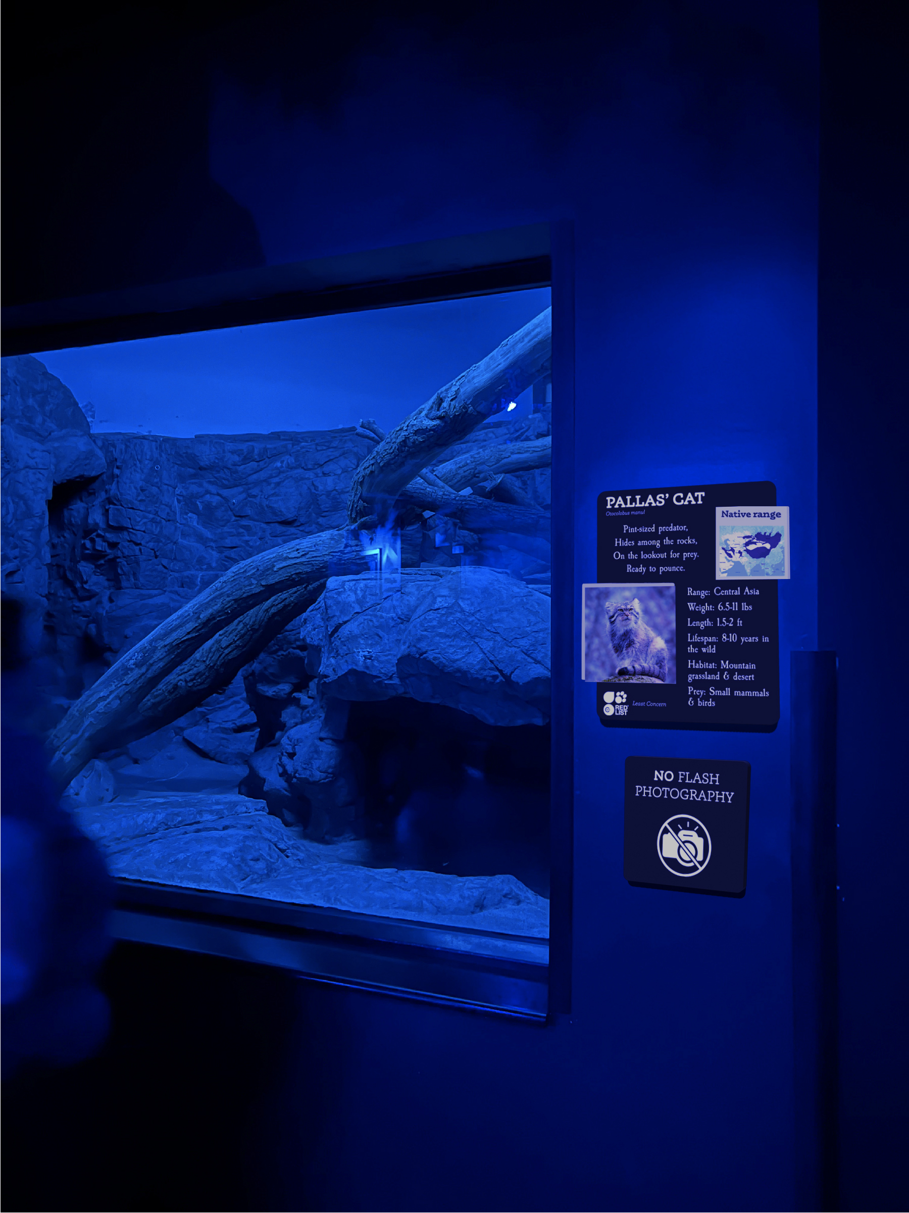
Phase III - Finalize System
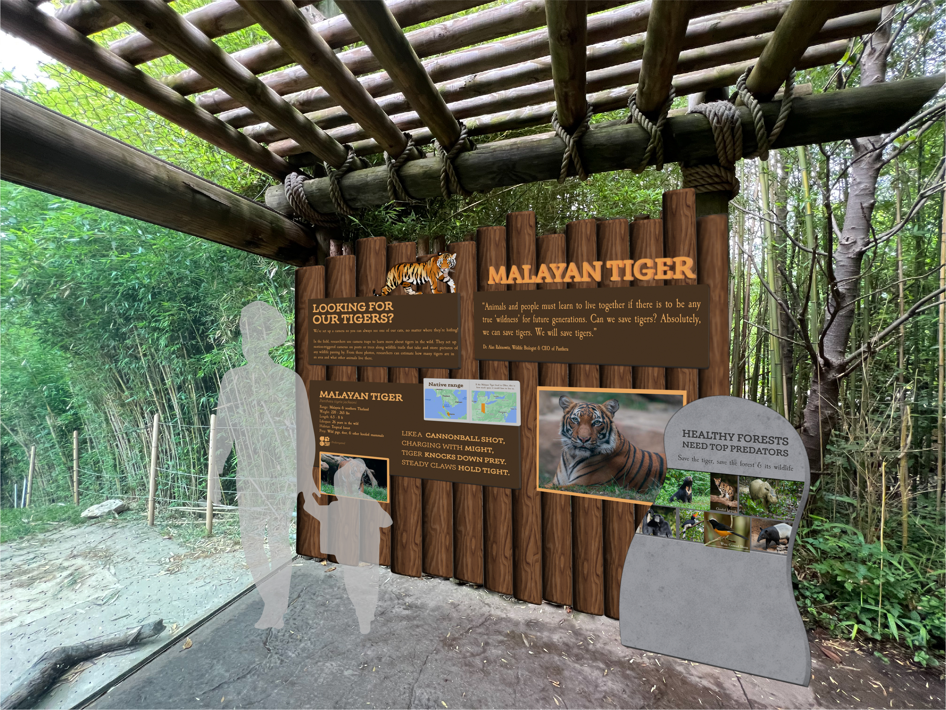
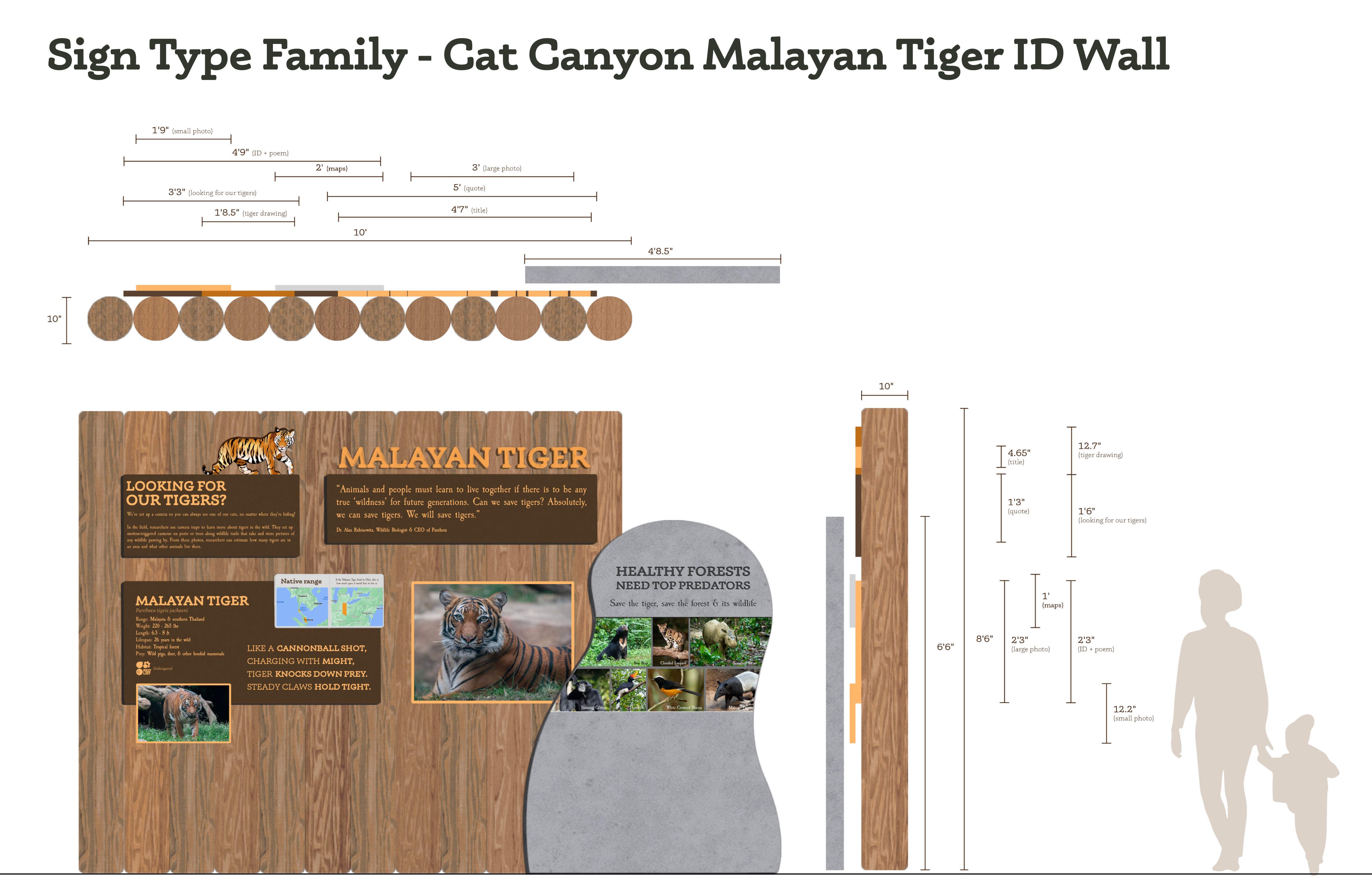
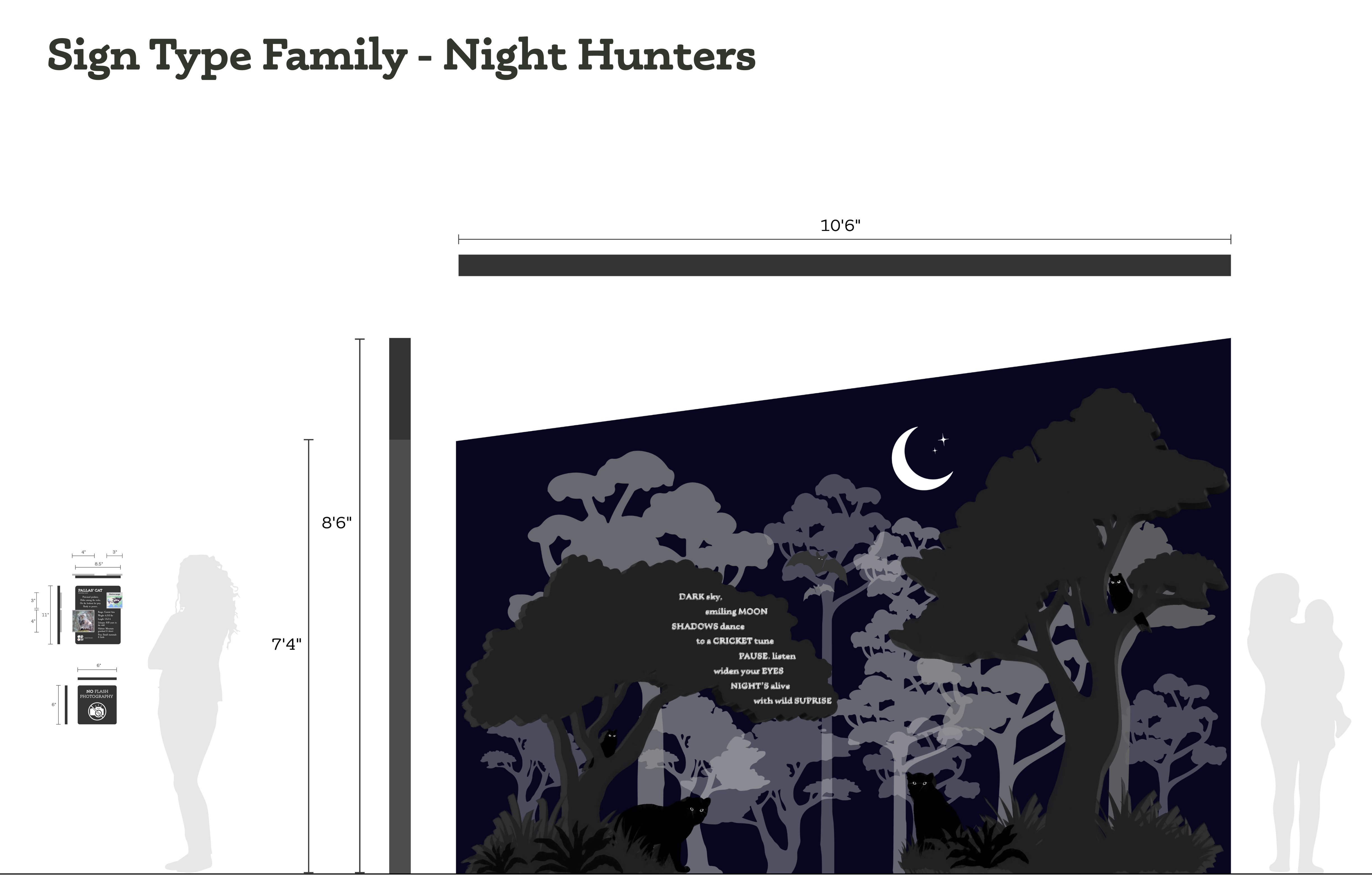
Ultimately, we designed eleven signs to replace nine existing signs. Breaking up information, adding wayfinding and regulatory signage, and improving the existing signs were key to developing the sign type families for both Cat Canyon and Night Hunters.


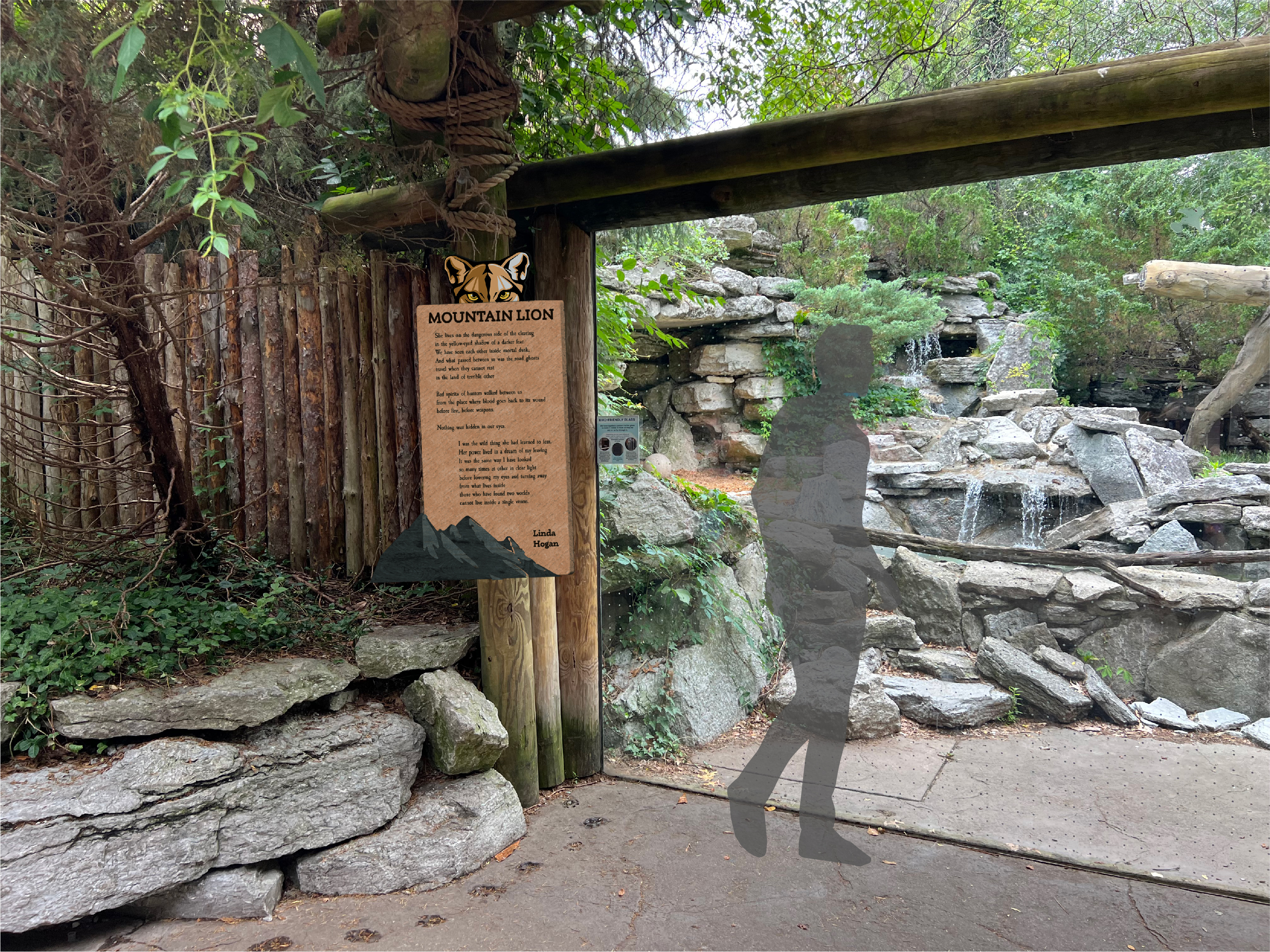
Final Sign Type Family - Cat Canyon

Final Sign Type Family - Night Hunters

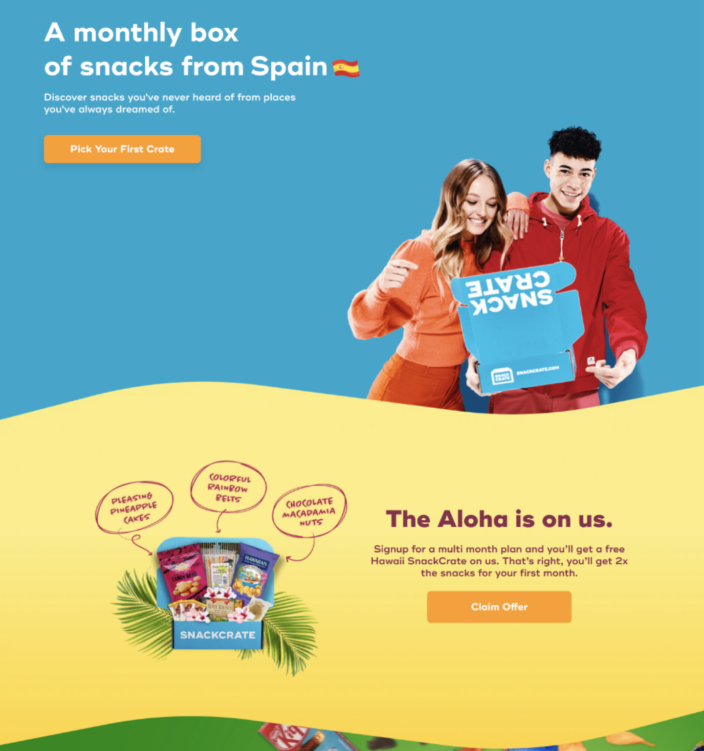
SnackCrate
SnackCrate is a subscription service-based company that curates monthly boxes, each featuring a different country’s snacks.
I worked on their marketing team during the Summer of 2022 and Spring of 2023. I worked on a variety of projects, including web, print, and social media design. As well, I conducted design research in various capacities to inform my work.
I worked on their marketing team during the Summer of 2022 and Spring of 2023. I worked on a variety of projects, including web, print, and social media design. As well, I conducted design research in various capacities to inform my work.

SnackBowl
At SnackCrate, a core value is education. I created a series of Instagram posts to better showcase this value to their audience on social media. Called SnackBowl, this series of educational posts is a Jeopardy-style, Quiz Bowl-esque series focused on eduacting their audience on a selected topic each week. I curated 52 topics – an entire year’s worth of content – and did loads of research to inform all of the questions and answers for each week.


Web Design
At SnackCrate, the main customer channel is the website. I worked on a redesign of the unboxing page to better integrate it with the design elements present on other areas of the site. As well, I worked to establish a brand library for use by their front-end developers.

Unboxing Page Redesign
In August of 2022, SnackCrate decided to enhance their unboxing experience with a new webpage for customers. As the brand evolved and more content was being created, the page was in need of a refresh in order to fit better within the rest of the site.
I took elements from the rest of the website to establish continuity and standardized type sizes across this page, as they had not been standardized in the past. This redesign creates a much more delightful user experience for their customers
I took elements from the rest of the website to establish continuity and standardized type sizes across this page, as they had not been standardized in the past. This redesign creates a much more delightful user experience for their customers
Existing Landing Page
![]()
Existing Unboxing Page
![]()

Redesigned Unboxing Page
![]()

Brand Library Creation
I conducted an audit of SnackCrate’s entire website in order to standardize the brand library for our front-end developers and web designers. This included standardizing:
- headers
- footers
- type sizes
- image treatment
- banners
- cards

Print Design
SnackCrate uses print communication with their customers in one specific area: crate inserts. Internally, they use print for brand guidelines.
SnackCrate’s brand guidelines were in need of a refresh. I redesigned this guide to include a newly written Verbal Identity Guidelines as well as refreshing the existing Visual Identity Guidelines. By properly curating these guidelines, every employee at SnackCrate knows how to talk about the company and what their design style is.
In order to not disclose company information, I am unable to showcase the internal contents of this book.

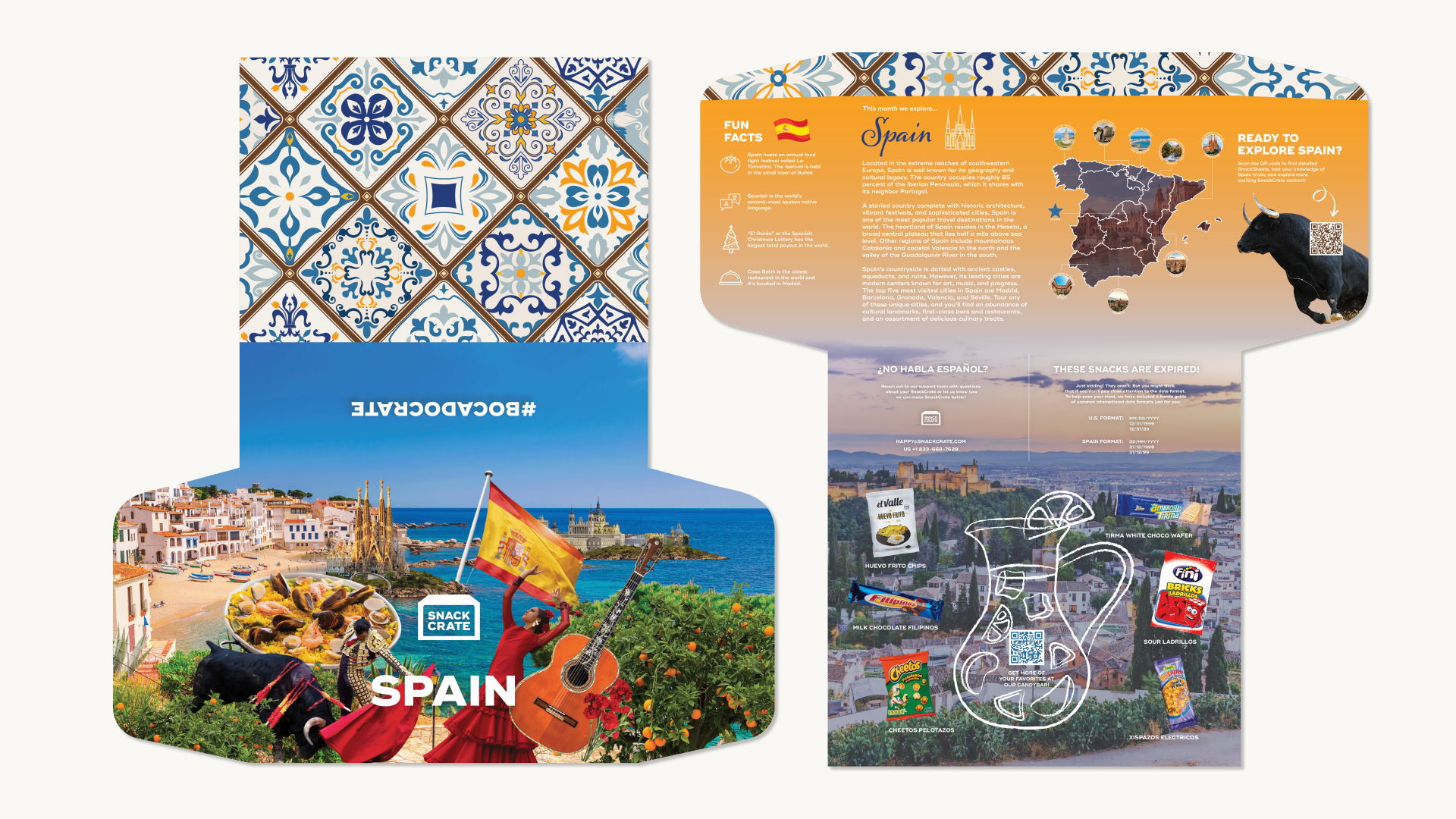
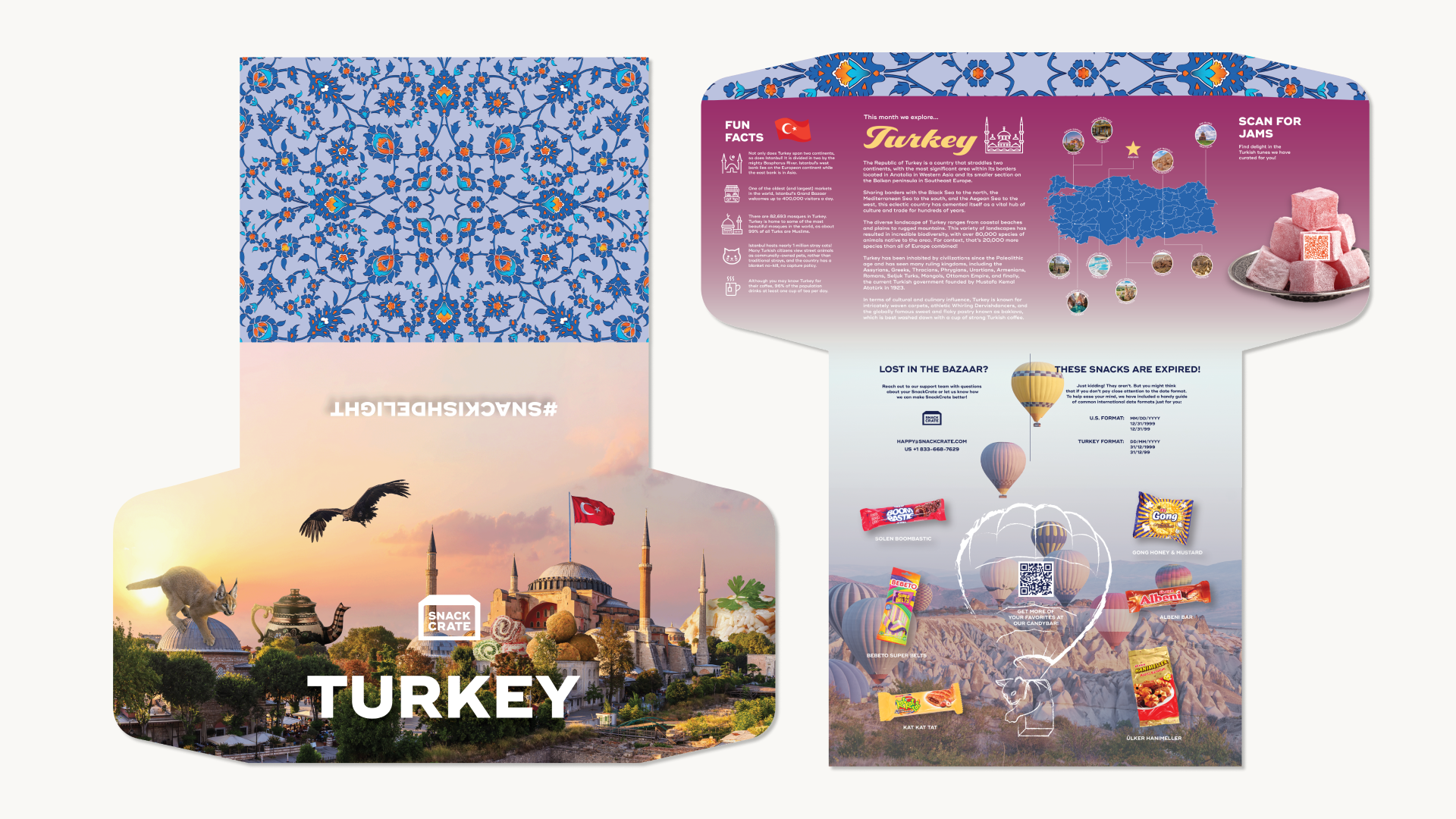
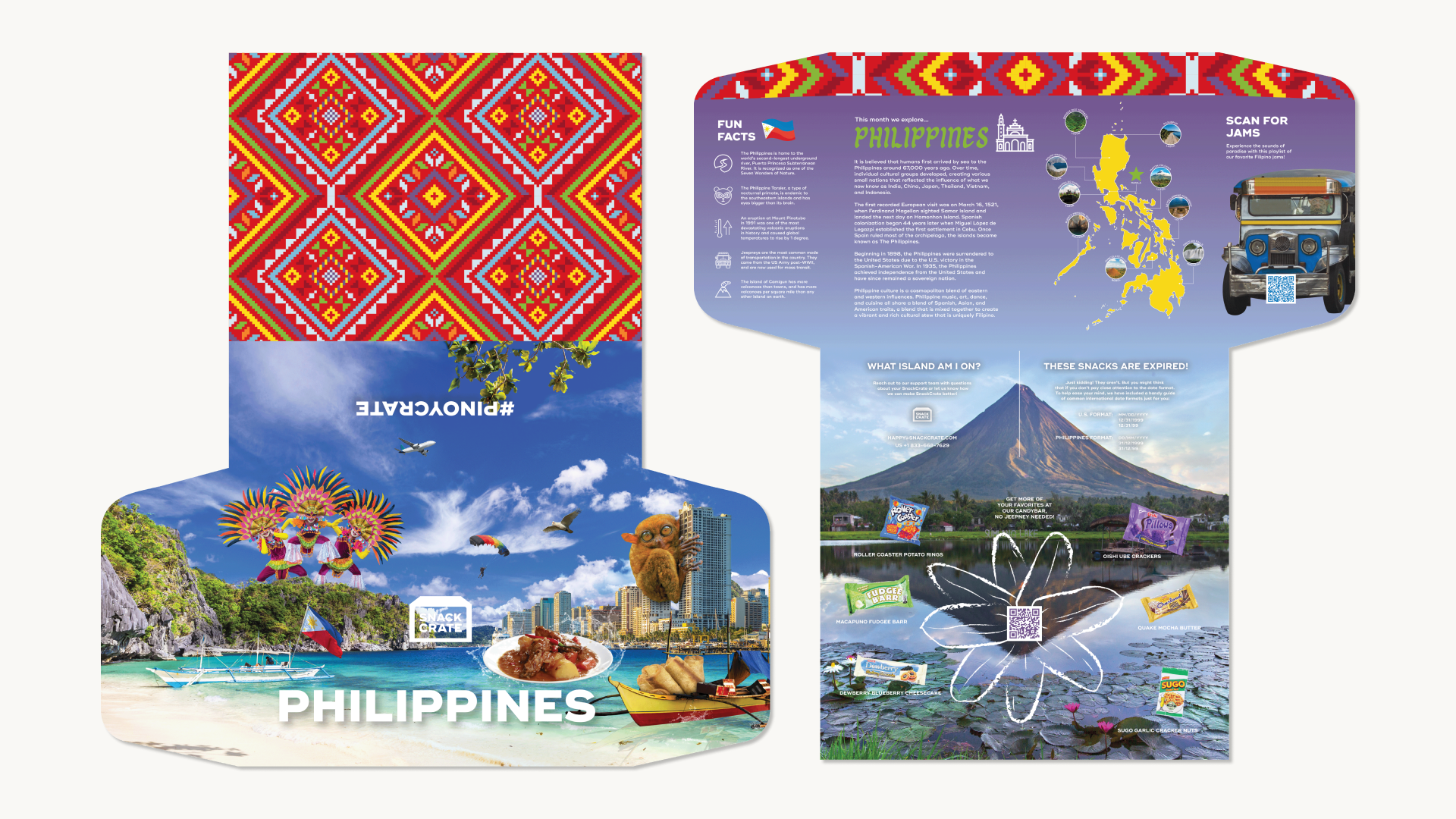
Crate Inserts
Each SnackCrate contains an insert informing the customer of:
- Country of the month
- Fun facts
- Map of the country with highlighted landmarks
- Country overview
- Snacks to showcase


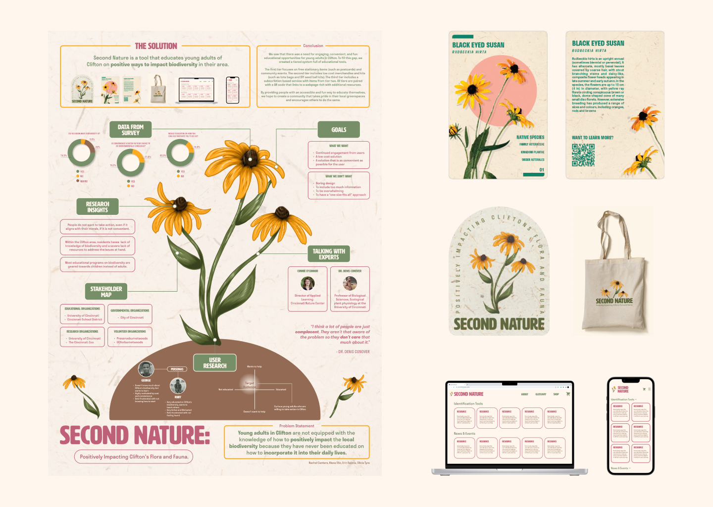
Second Nature
This project was a semester-long exercise in design research created for my Design Methodology I class.
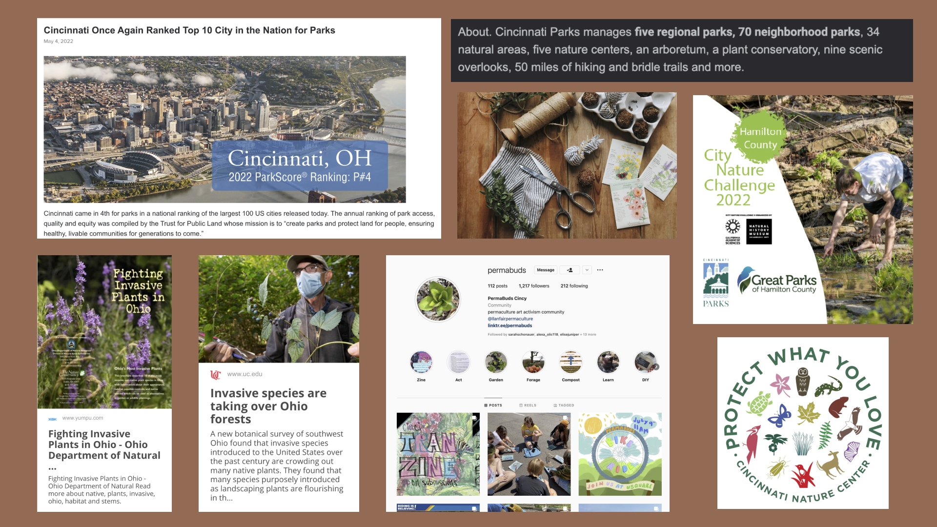
Our class split into small groups to research a topic that has both global and local implications. My group chose to investigate the lack of biodiversity and conservation education present in both our local education systems and globally.
Initial Ideation
The semester began with every person in the class working individually to define issues that they are passionate about.
Upon coming together on our shared interest of biodiversity education and conservation, my group worked to continue defining what the problem is and how we can work to create a solution.
Upon coming together on our shared interest of biodiversity education and conservation, my group worked to continue defining what the problem is and how we can work to create a solution.

Research Insights
The primary research phase began with us outlining two surveys:
Our user survey showed us that people are aware of what biodiversity is, but they just don’t know how it relates to their daily life.
We ultimately ended up interviewing two individuals who work in the conservation space. Both interviews gave us a great deal of insight as to how we can make an impact and what niche we can work to fill with our solution.
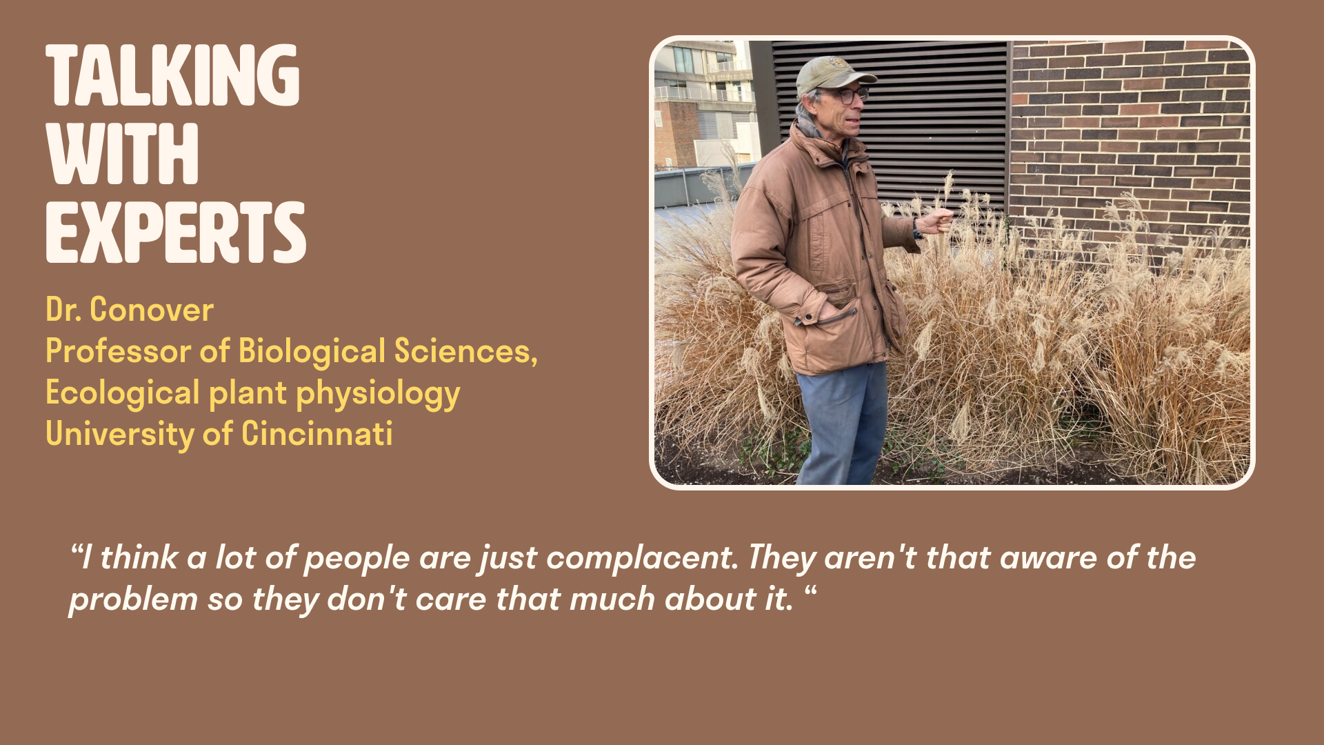
We also attended a nature walk with Dr. Conover to learn firsthand what species effect our local biosphere.
- one for potential users
- one for potential stakeholders
Our user survey showed us that people are aware of what biodiversity is, but they just don’t know how it relates to their daily life.
We ultimately ended up interviewing two individuals who work in the conservation space. Both interviews gave us a great deal of insight as to how we can make an impact and what niche we can work to fill with our solution.
We also attended a nature walk with Dr. Conover to learn firsthand what species effect our local biosphere.


Our Goals
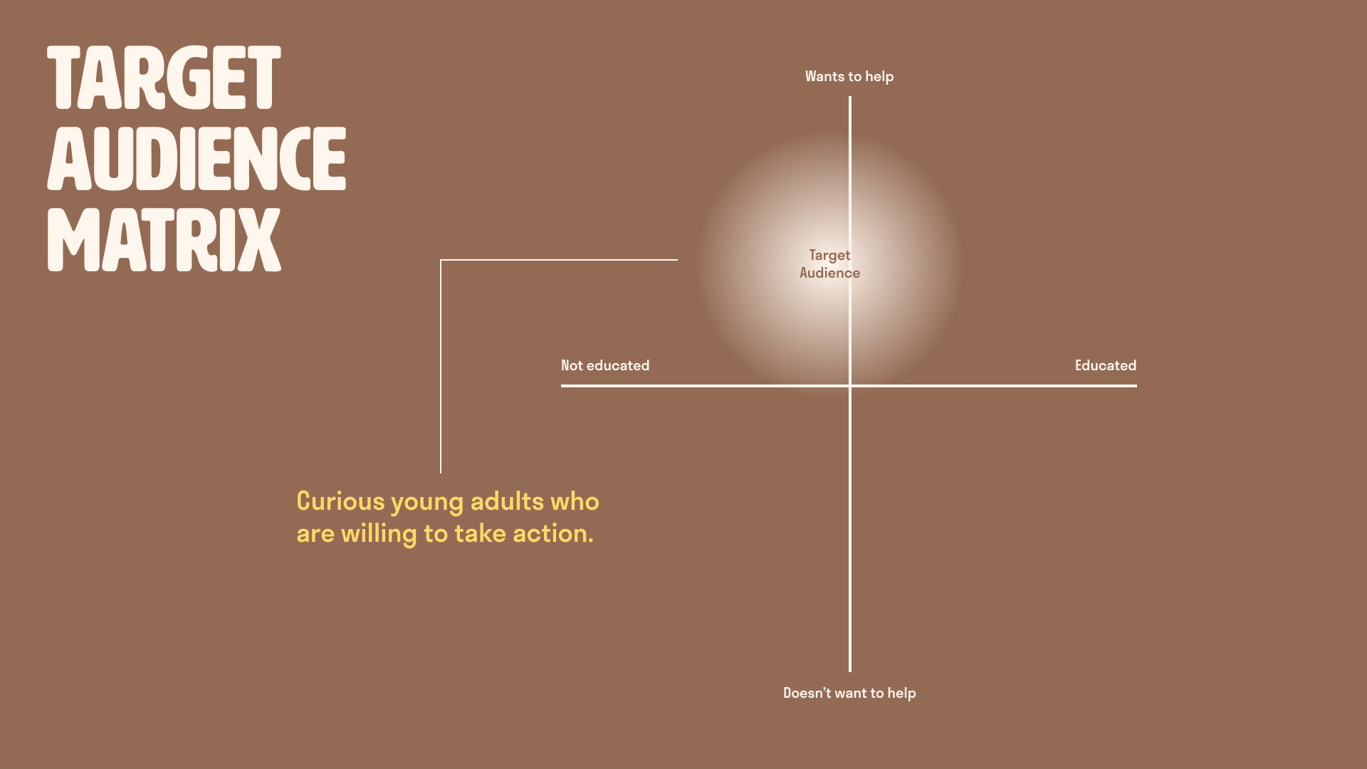
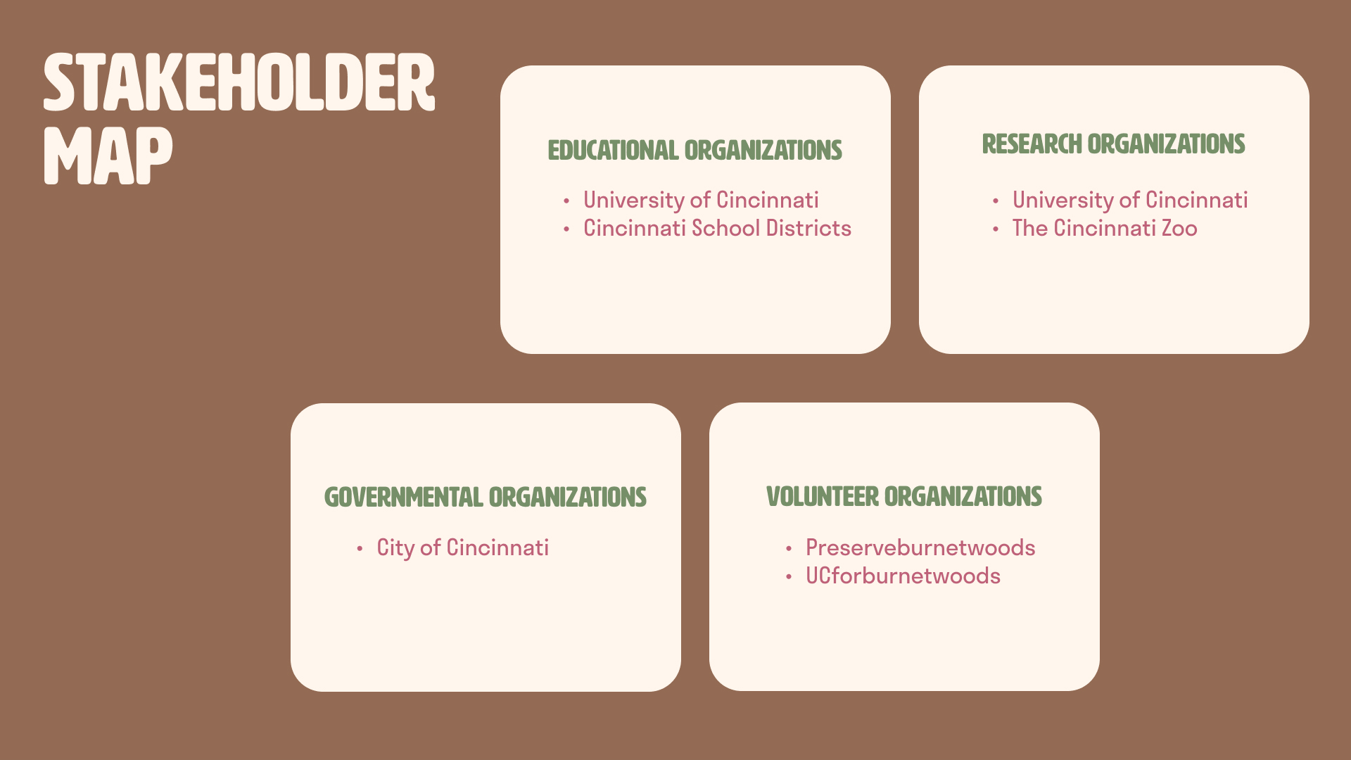
We created a target audience matrix to better define who we were creating this solution for. As well, we defined stakeholders within the area that would be likely to uplift our solution.
In order to narrow our focus further, we ideated on what we wanted to accomplish with our project as well as what outcomes we didn’t want.
In order to narrow our focus further, we ideated on what we wanted to accomplish with our project as well as what outcomes we didn’t want.

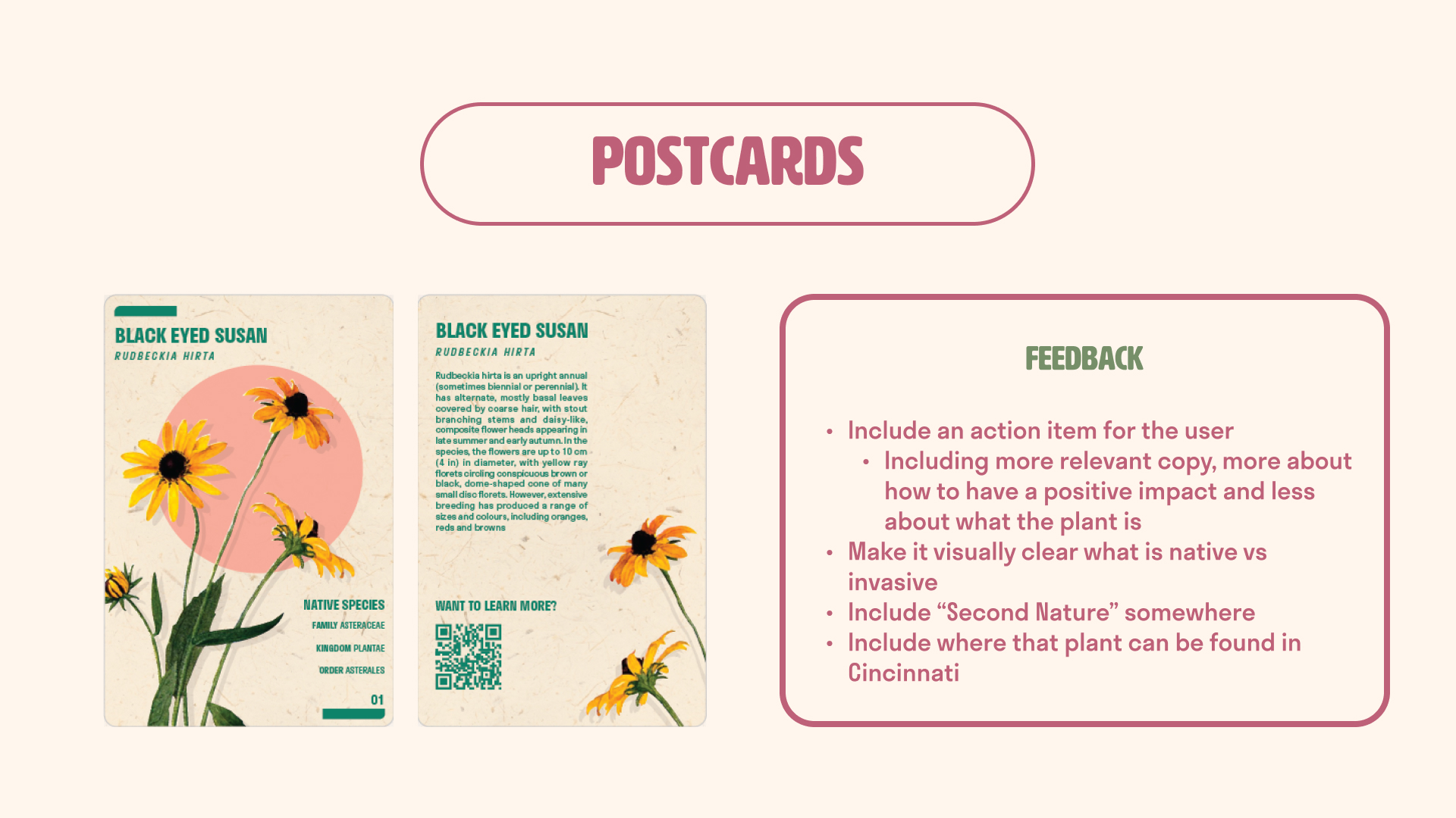
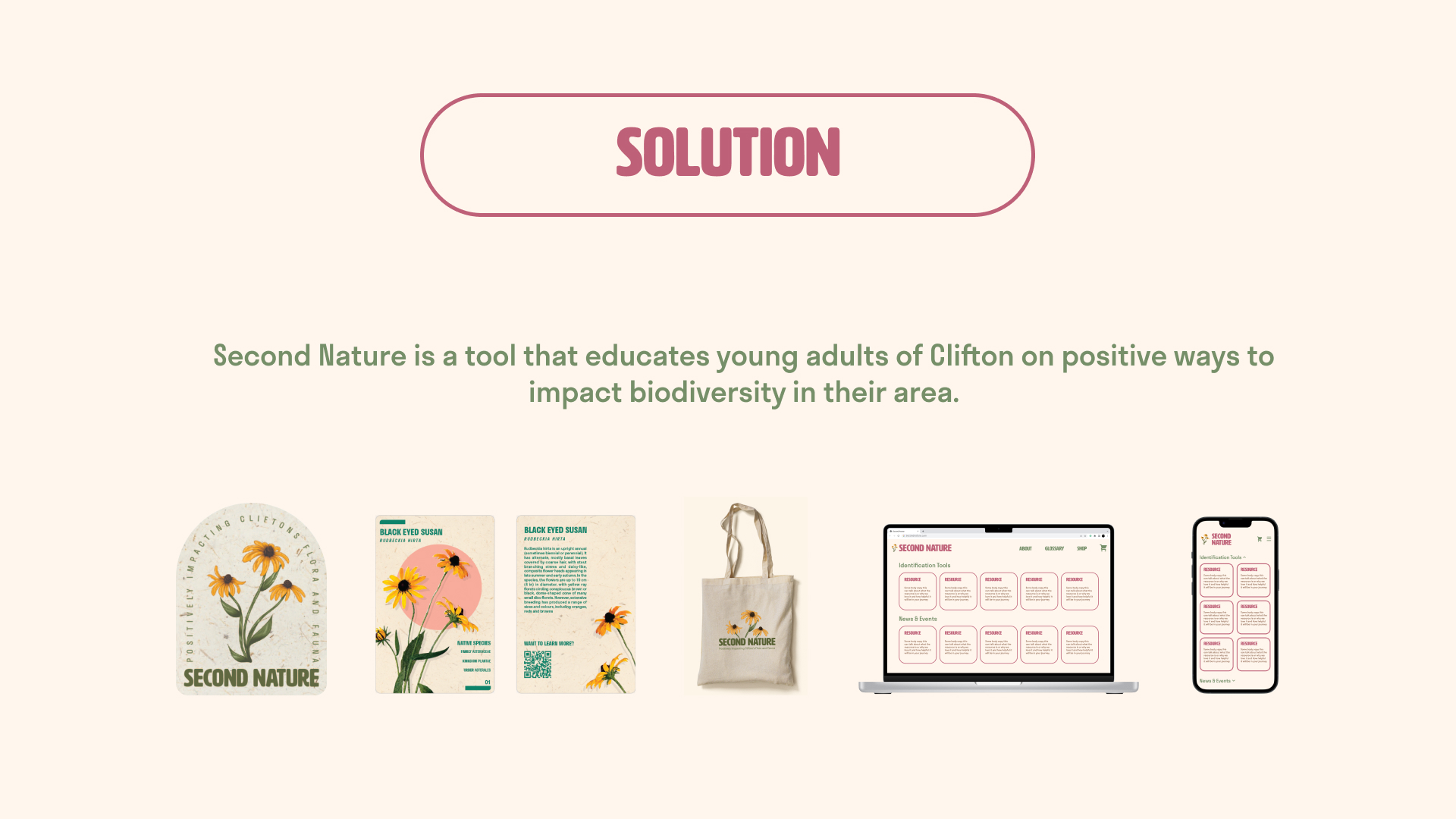
The Solution
The goal of this class was not to find a final solution to our problem; it was to fall in love with the research process. I think we did just that.
My team and I landed on a hybrid solution. Our tool, Second Nature, would work by educating the public through a tiered system of goods to educate themselves and support our mission.
View our entire presentation here.
My team and I landed on a hybrid solution. Our tool, Second Nature, would work by educating the public through a tiered system of goods to educate themselves and support our mission.
View our entire presentation here.


Final Poster Design
