UC School of Design Website
For my Interaction Design II course, we were tasked to redesign the existing website for the University of Cincinnati’s School of Design (SoD).
Our class split into teams of four each to tackle the redesign.

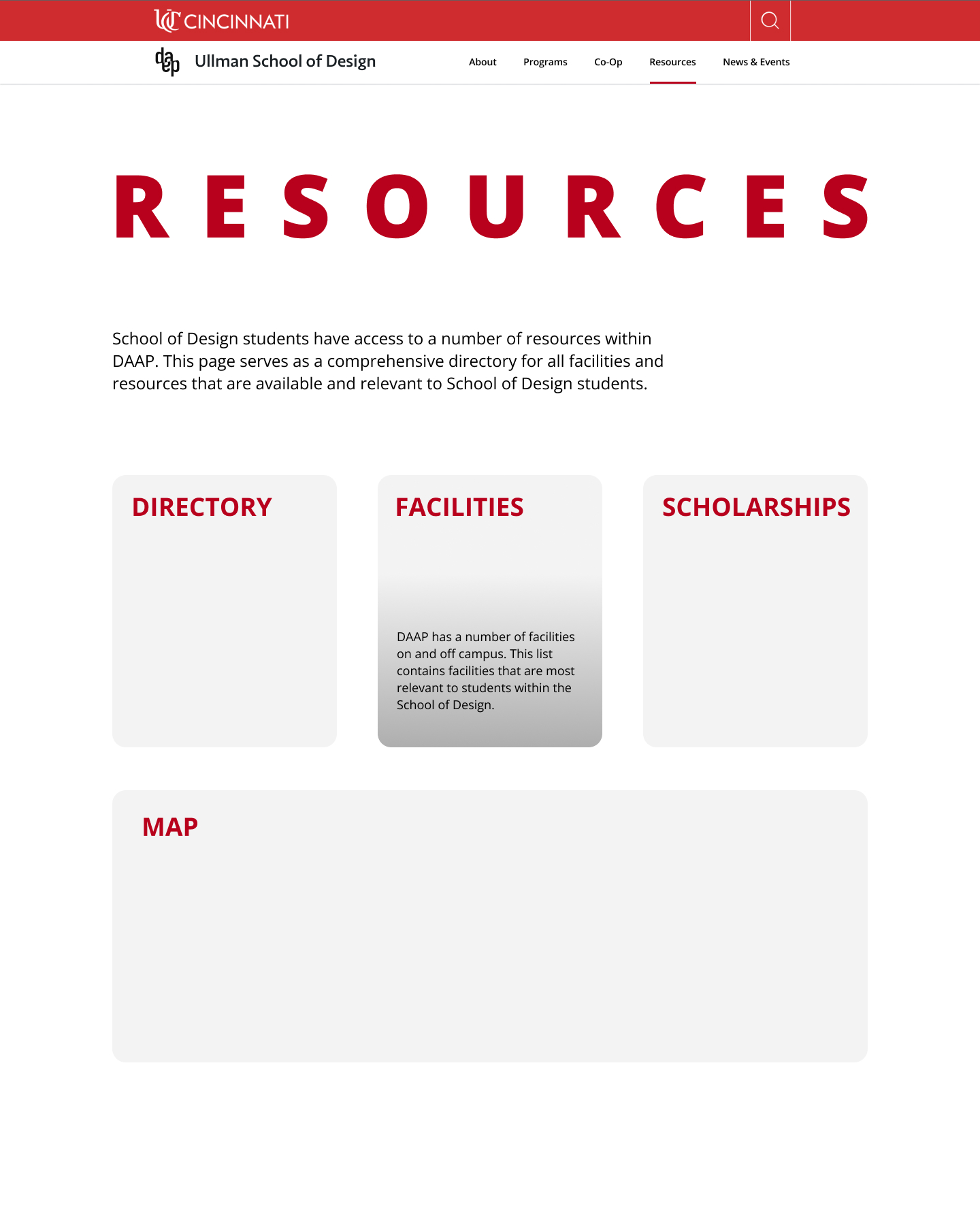
Wireframes
Our process began in the research and benchmarking stage. We:
We all took our own approach to the design of our sections with the intent to unify a design system in the next stage by picking the most effective ideas from our respective sections.
- evaluated site heuristics
- benchmarked other sites
- wireframed new designs
We all took our own approach to the design of our sections with the intent to unify a design system in the next stage by picking the most effective ideas from our respective sections.
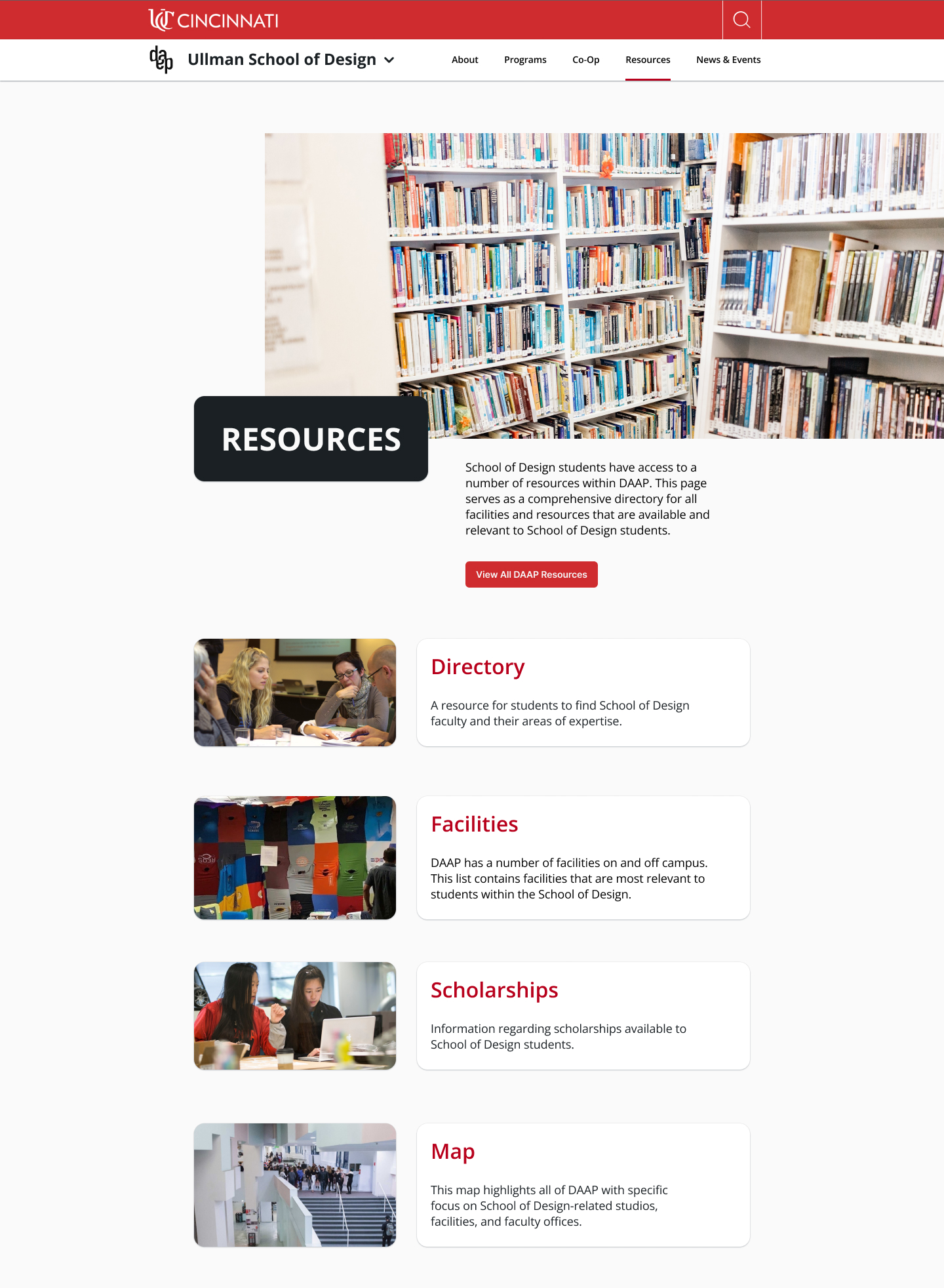
Lo-fi Designs
In this stage of the redesign process, we unified a design system and tested some layout designs. We then refined and landed on our final design style.
Upon landing on our final design system, we conducted usability tests with eight subjects to ensure our site was easily navigable and predictable for users.
Upon landing on our final design system, we conducted usability tests with eight subjects to ensure our site was easily navigable and predictable for users.
Style guide
Upon refining our design system, we created a style guide to pull assets from to ensure our site was unified. To do this, we:
- standarized type sizes and usage
- created color variants
- redesigned button system

Hi-Fi Designs
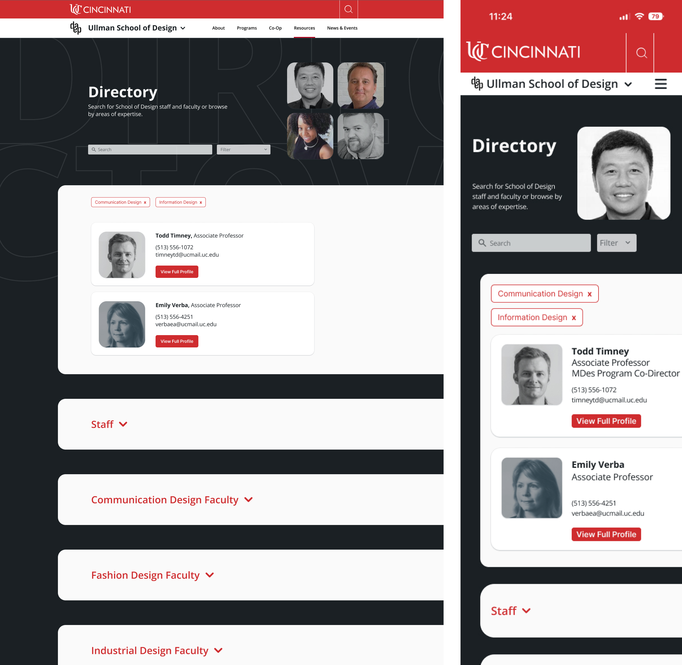
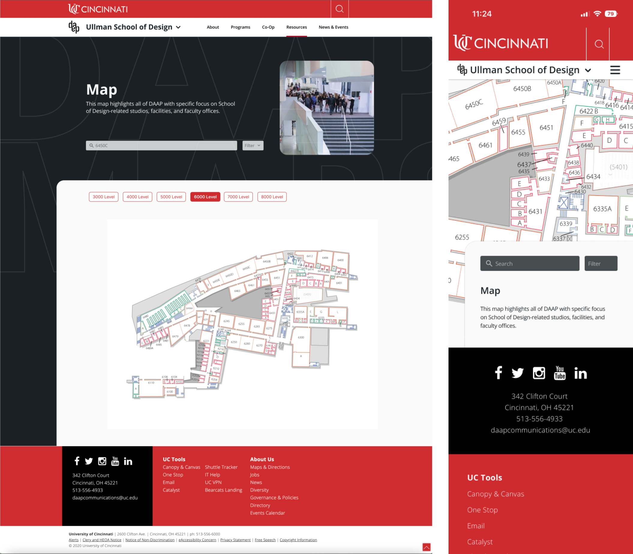
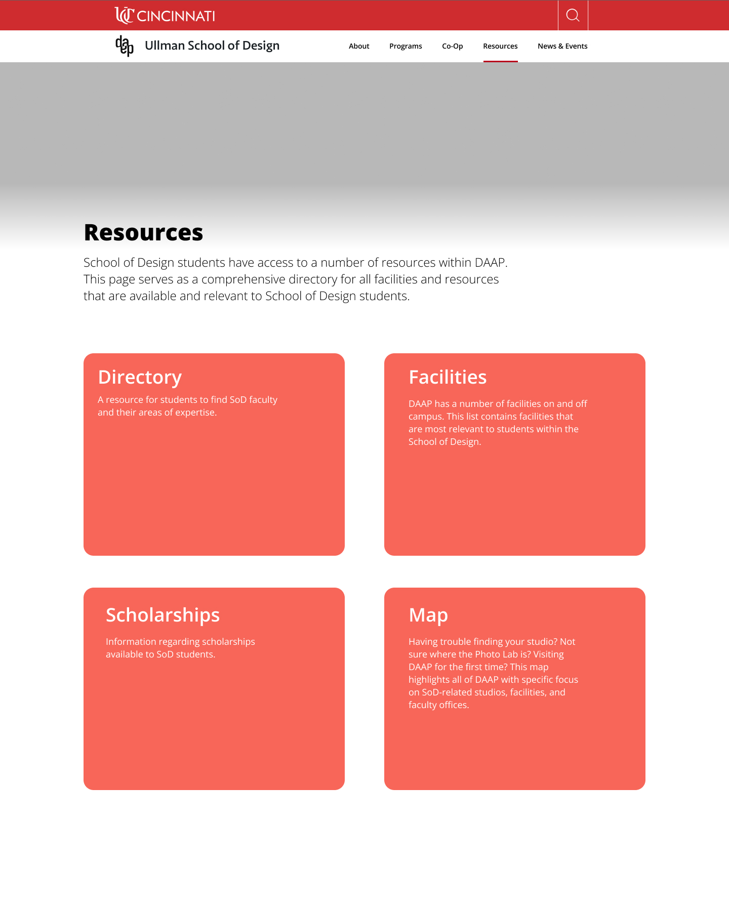
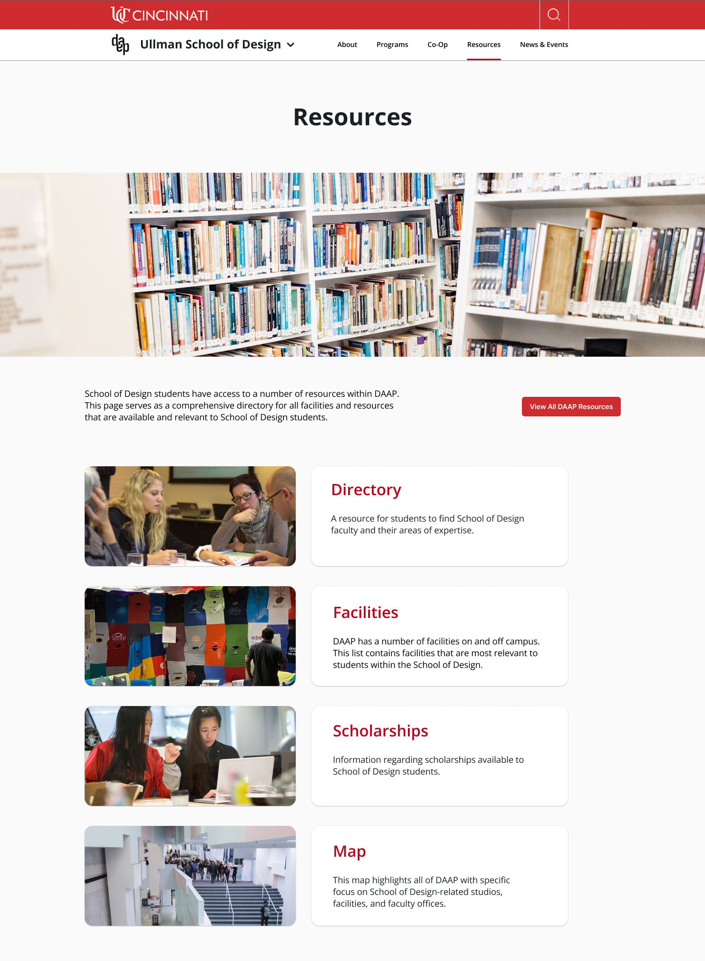
I was responsible for designing the Resources section of our site, including all sub-pages.
This included:
In order to allow students to easily find the information they were looking for, I created a set of filter tags to create an easier searching experience across the Directory and Scholarships pages.
In order to make the building less intimidating for students, my team and I concepted an interactive map to search for classrooms, staff offices, and facility locations.
This included:
- staff and faculty directory
- facilities in SoD
- SoD-specific scholarship hub
- map of the building
In order to allow students to easily find the information they were looking for, I created a set of filter tags to create an easier searching experience across the Directory and Scholarships pages.
In order to make the building less intimidating for students, my team and I concepted an interactive map to search for classrooms, staff offices, and facility locations.


Desktop + Mobile